Abstract Art
Abstact art and photography are both very simular in what both things try to capture in the audiances eyes. Usually, abstract images tend to have some sort of smaller image or meaning inside the photograph, this could be done by adding small out of focus elements to the image or having it focus on bright, bold primary colours as well as the texture of the image and the type of patterns they hold. Each of these componinets together work to achieve an abstract depiction.
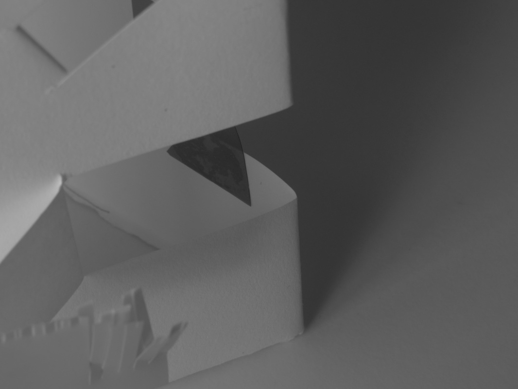
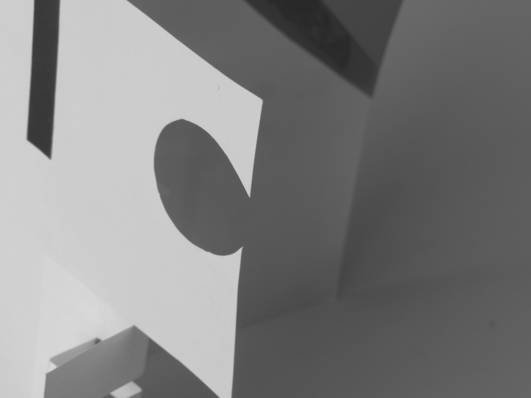
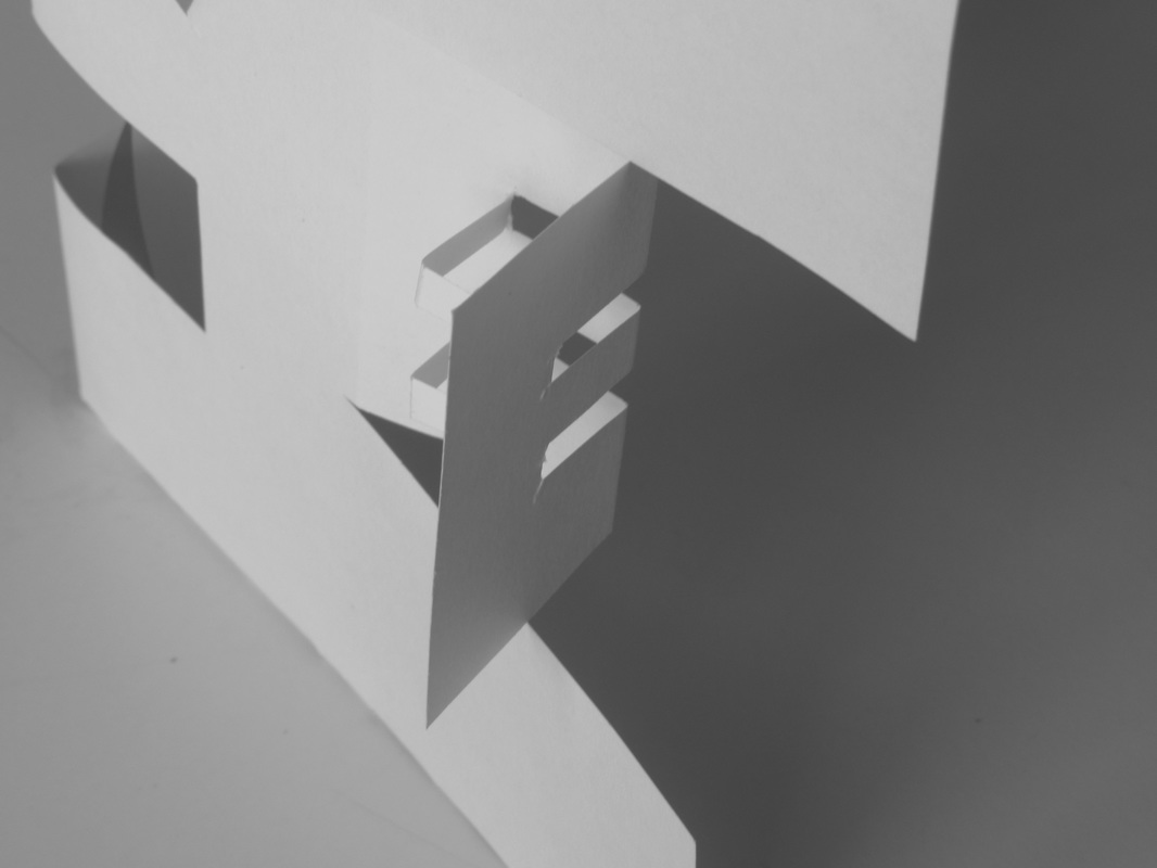
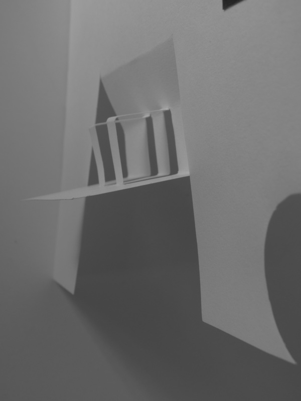
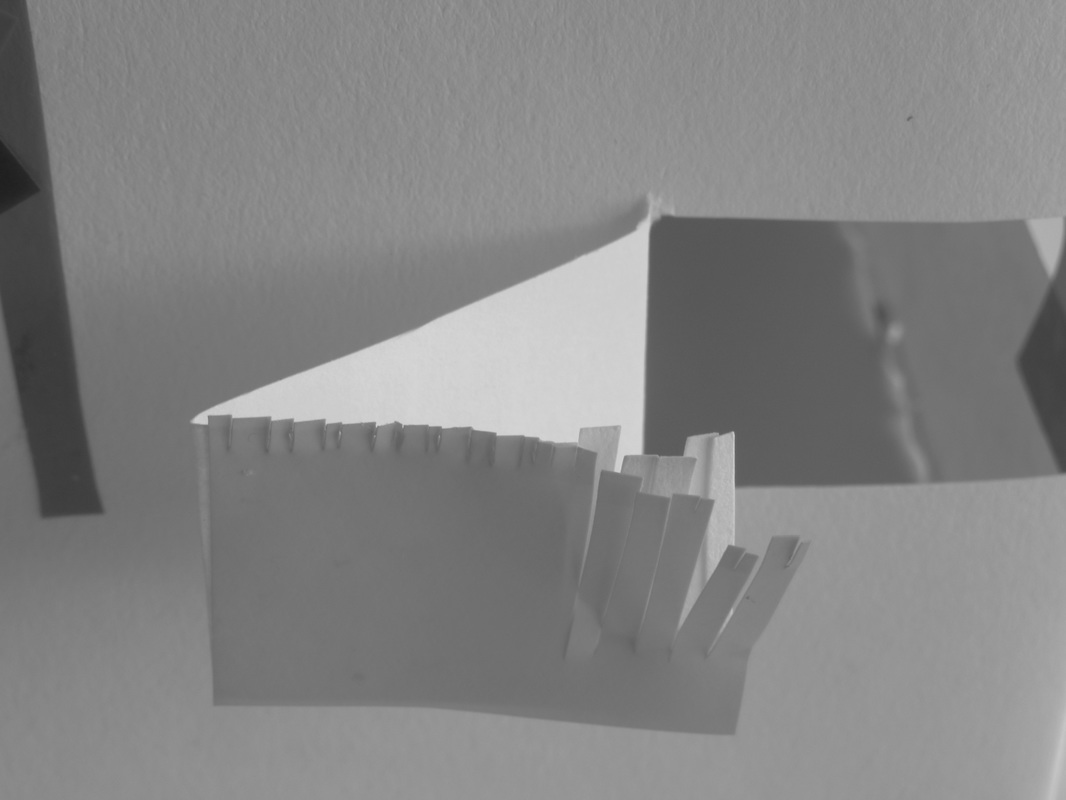
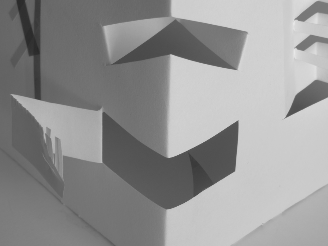
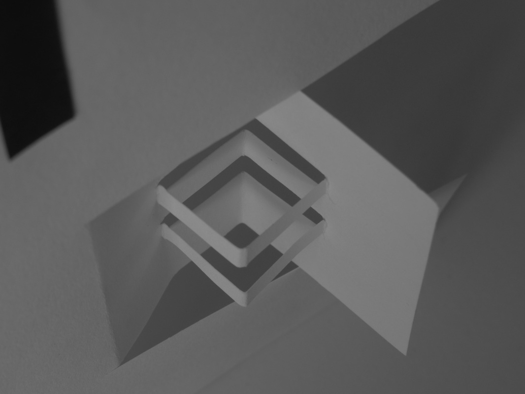
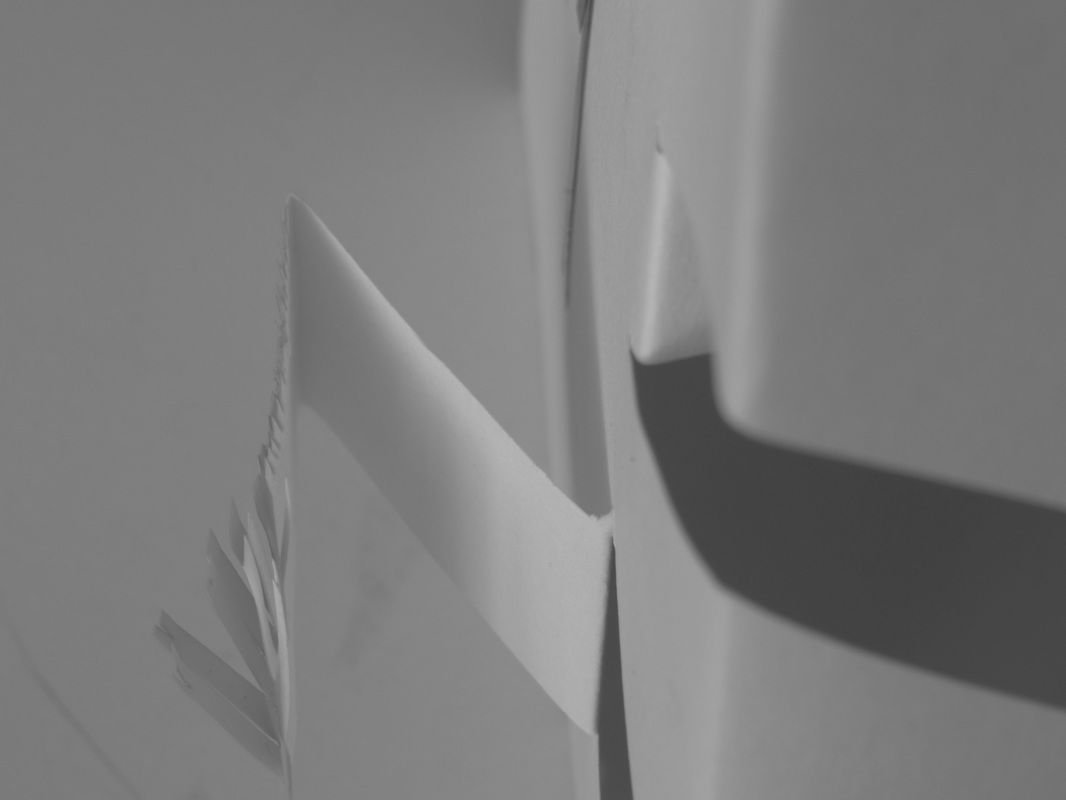
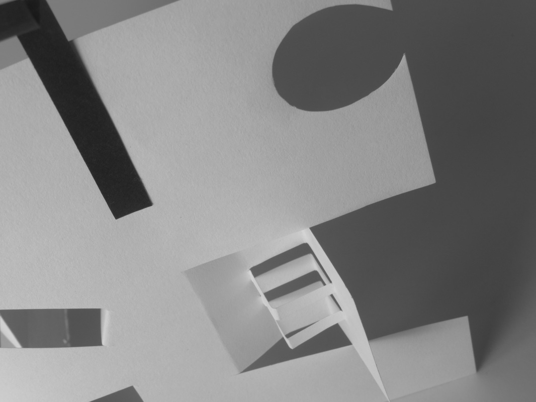
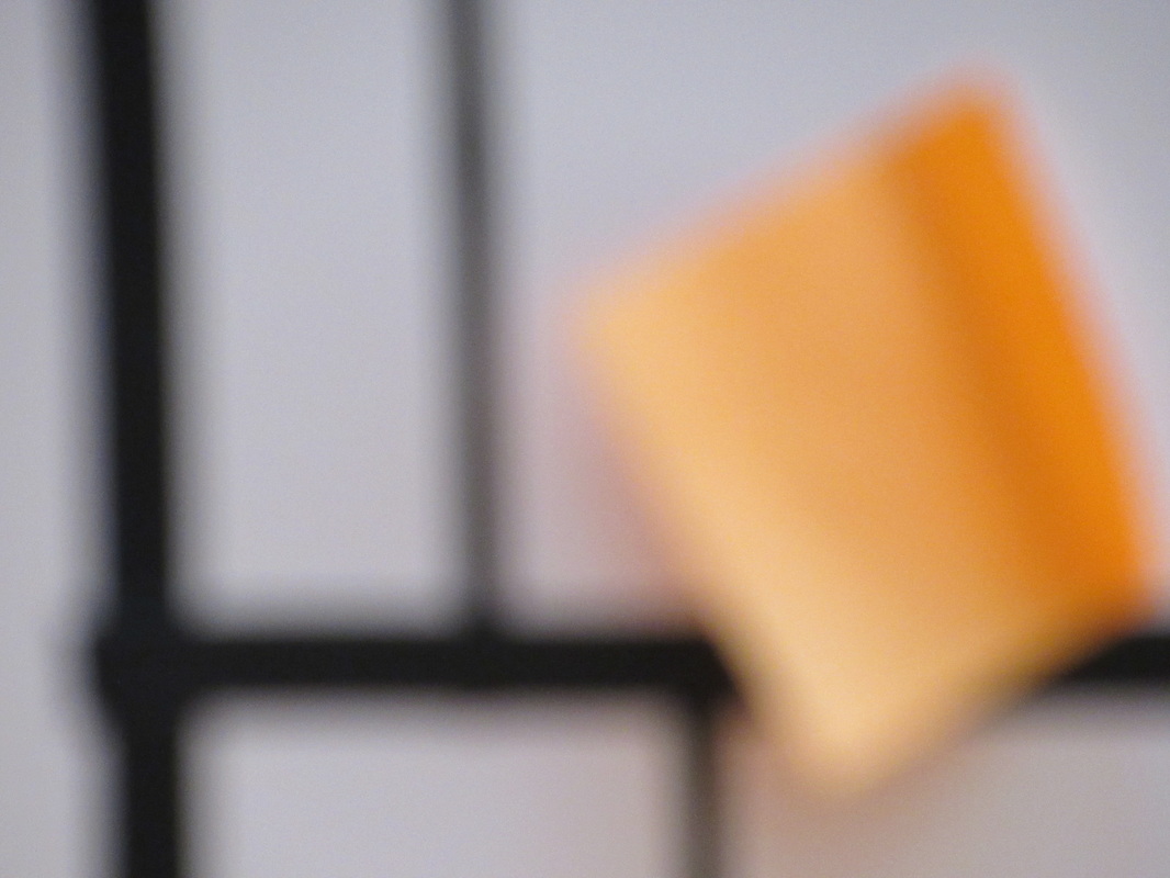
To start creating my own abstract images, I watched a short video of Anna lucas making a DIY sculpture simply out of plain paper and primary coloured shapes. The video also included different ways light could be produced and devilled in photographs. I then made my own small sculpture out of an A4 piece of paper. I added cuts and bends to the A4 sheet to give more ways to produce shadows and edges. When I begin to take the photographs of my simplistic sculpture, I was set the last to not include anything but the paper and the table I was photographing on. At first, this was difficult, but it meant I has to focus more on the composure and angles I was taking my images. I chose to use a black and white filter over my images despite the importance of primary colours. I did this because I wanted the overall focus of the outcome to be on lighting and shadows. The majority of my images are closeups which i thought looked quite interesting. It showed the shading and different shapes in more detail, but if I was to take these images again, I would probably create a more birds eye, long distance photograph to show the sculpture as a whole.

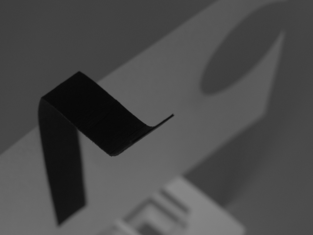
I chose to take images of my sculpture outside. I felt this would include more colour and brighter lighting for the sun. I didn't edit these photos into black and white, because I wanted he colours to be a main focus in these outcomes.
Formal elements
|
|

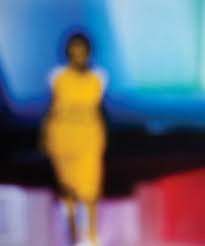
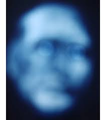
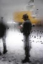
Bill armsrtong mainly presents 'Out of focus' images in his abstract photography.
Personally, this image really stood out to me because of the shapes and use of bright and dark colours. The distorted figure in the centre of the image gives the viewer some uncertainty of who is in the image and my make the viewer question what is happen in the photograph giving it a sense of mystery. The lighting in the middle is very clear and defined even though the outlining isn't sharp, it seems as though armstrong's used artificial lighting in this image because of the bright blue. Theres a lot of what appears as empty, dark space around the image. |

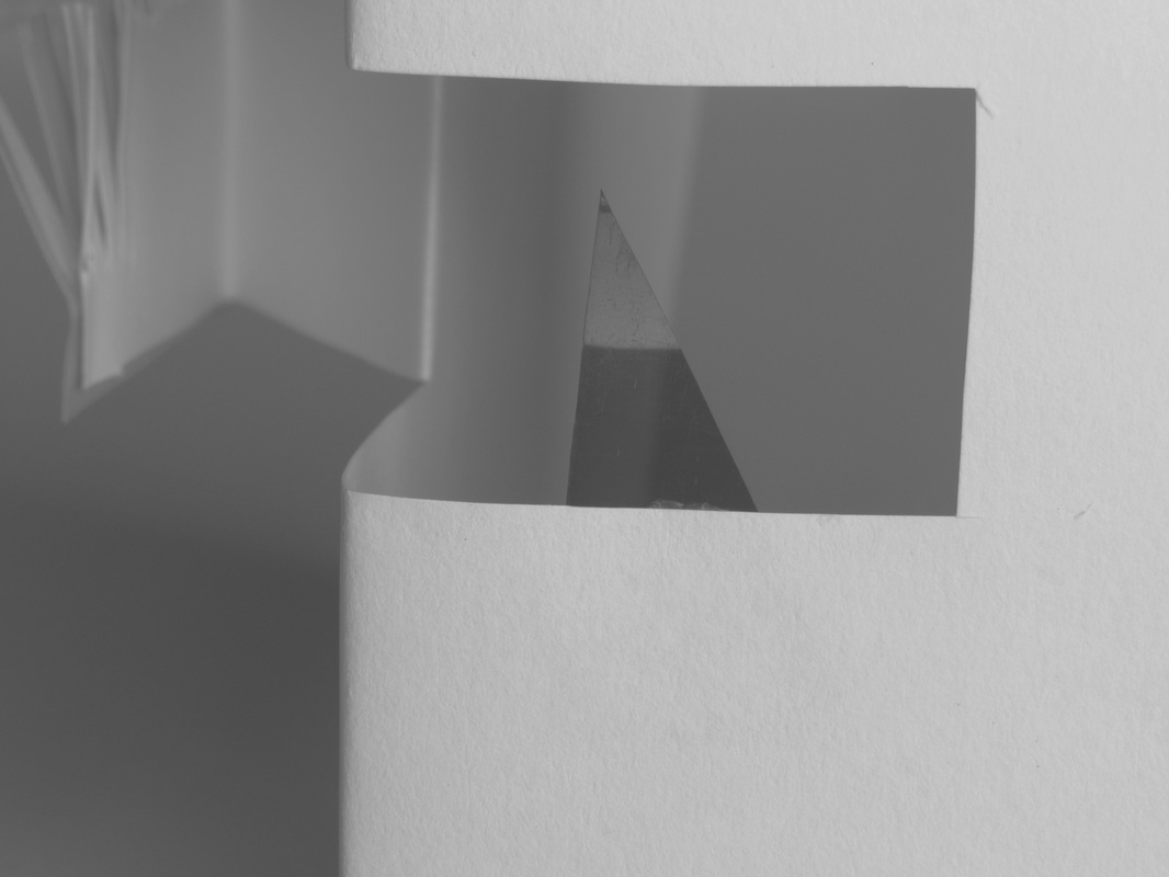
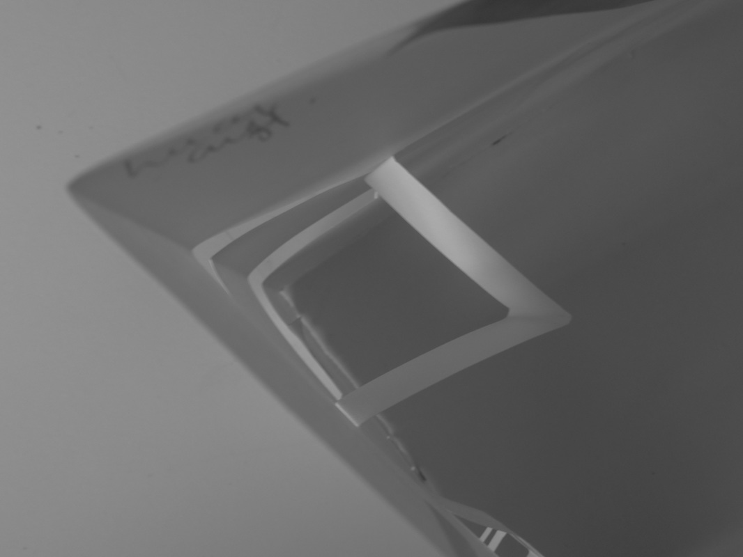
A4 Paper photos
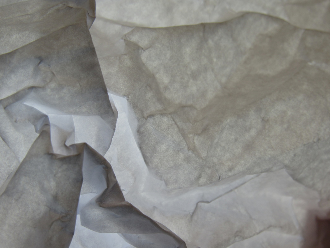
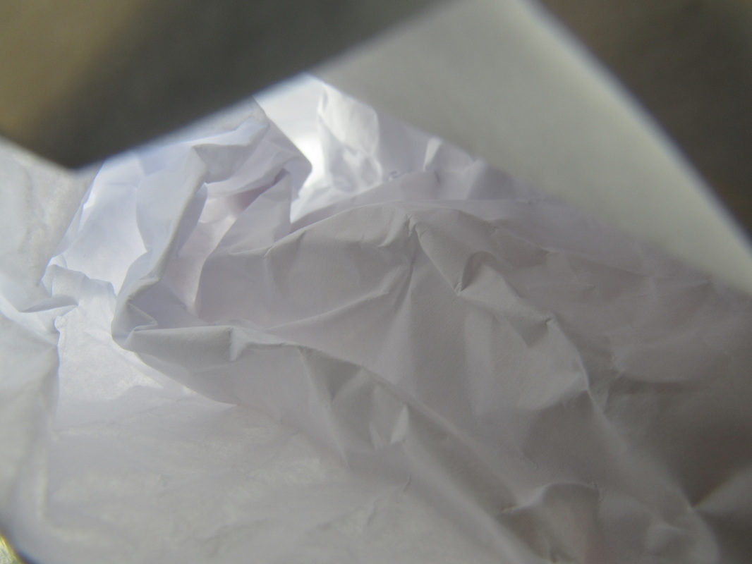
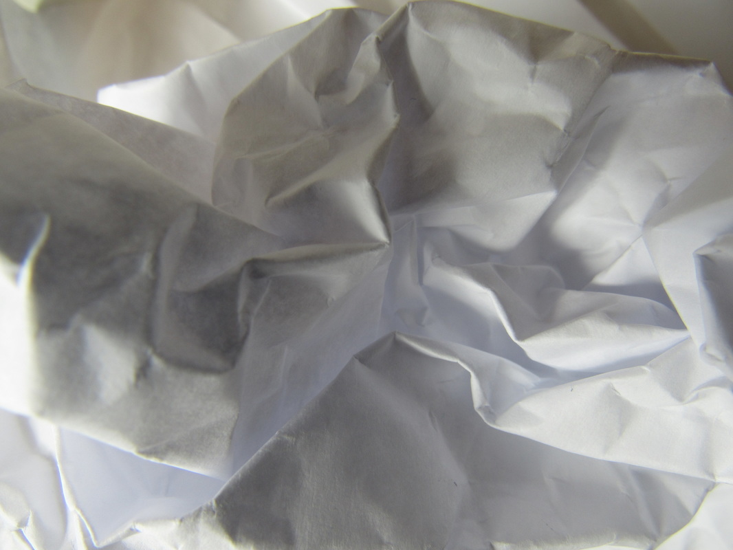
In this task we took images of paper making different shapes and shadows and we had to try and take pictures of only the paper and nothing else, even in the background. I thought the task was going to be easy because all we had to do was take images of the paper, but it ended up being quite hard because of what we had to achieve in the images and what we weren't allowed to get into the photographs.
To improve my work, i would probably take as many different images as i can but because it was difficult to take different images with it the background in it, i found i didn't take a big range of images as i would like.
To improve my work, i would probably take as many different images as i can but because it was difficult to take different images with it the background in it, i found i didn't take a big range of images as i would like.
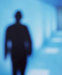
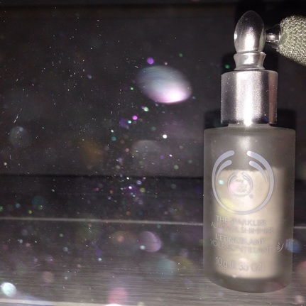
Out of focus
|
I took this image a while ago and i think it perfectly fits the 'out of focus' theme in abstraction. The main aspects of the image are the unclear specs of glitter shining across the image and i think thats what makes this photograph so pleasing to the eye. personally i was quite pleased with this image, but, to improve it i would probably make the out of focus aspects even more visable and more of the main part of the photograph. |
Personally I found abstract quite difficult because sometimes bright colours don't stand out as quickly as you think, but, as i walked around more and looked around, sometimes small things like bright colours or interesting shapes start to be clearer.
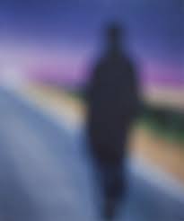
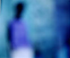
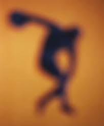
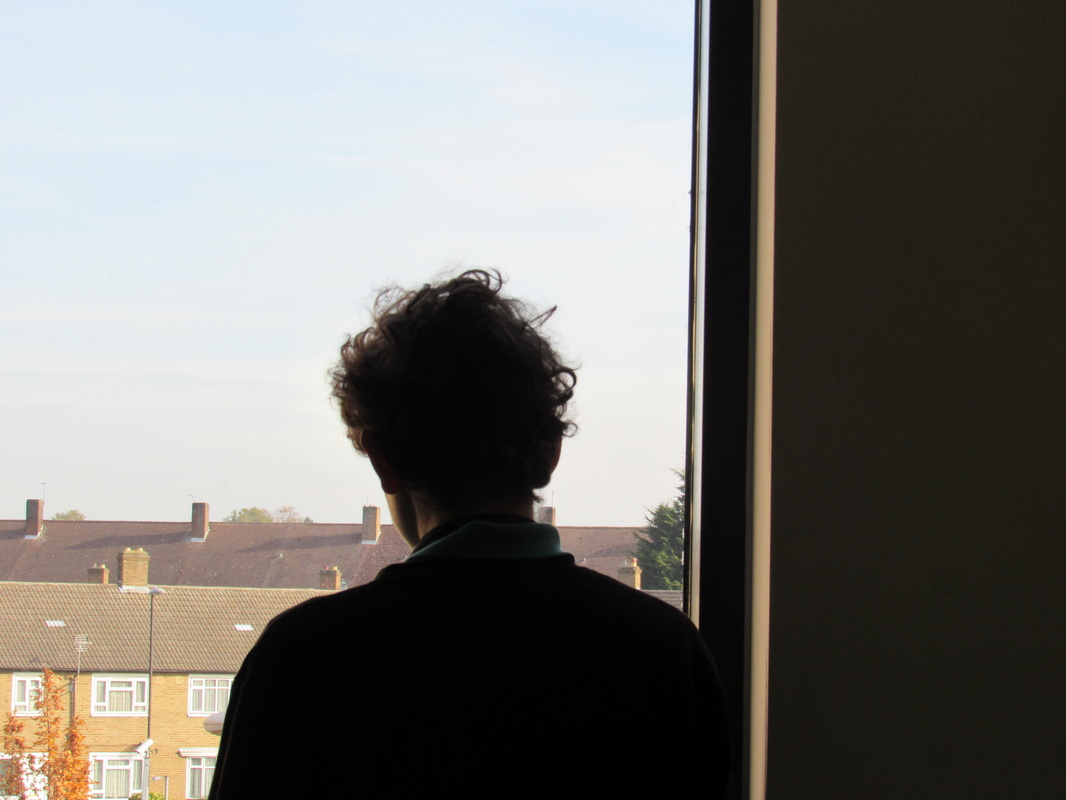
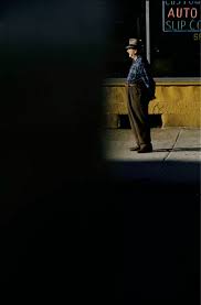
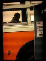
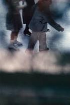
Saul Leiter
|
I chose this image because when looking at it, the colours in the top right corner really stood out to me as the image is mainly focused on the bright primary colours and the man standing there.
there isn't much in the image that is necessarily 'unusual, nor surprising except for the fact that the viewer may find the image interesting due to the fact that an old man is standing alone staring into the distance , keeping us clueless as to what he may be looking at with such a curious looking posture. i think the most important formal element used in this image is focus and out of focus. the photographer purposely composed the image to have the top right corner to be the most eye catching because of the fact that the rest of the image is a dark, 'out of focus' empty space, with very little detail nor grain. |
|
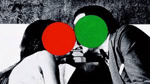
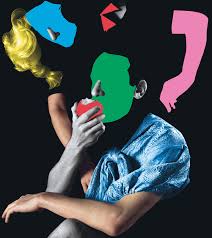
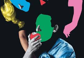
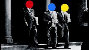
John Baldessari
|
|
John Baldessari is an American conceptul artist known for his art work of photographs he found in bins or took from other people.
Baldessari would often look through bins for peoples old strips of film, and would then create the images into abstract art that he thought was more 'interesting' then the origianal photos that he would usually describe as 'boring'. These images would range from simple family photos, to images of men shaking hands and greeting each other. Baldessari decided he wanted to make these images more pleasing to the eye and colourful. John is most famously known for his work of placing coloured shapes on peoples faces, hiding they're epressions and changing them into simple circles of primary colours. A lot of Baldessaris earlier work were paintings but in the 1970s he found an interest for prints and film where he began to create the abstract images we know today. |

Hannah Höch
|
Hannah Höch was a German dada artist. A dada artist was someone who would create Dadaism art which was a way of putting political views through art. this was popular in the 20th century. Hannah would base alot of her art on her feminist views which was mainly influenced on how woman were compared to men in the past.
Hannah would create art from rearanging images and text into to knew collages known as photomantages. Her art would usually spark alot of interest because of its abstact and unsusual posisionings which were very much influenced by the artist Picaso. |
|
Final Piece Plan
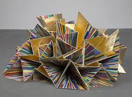
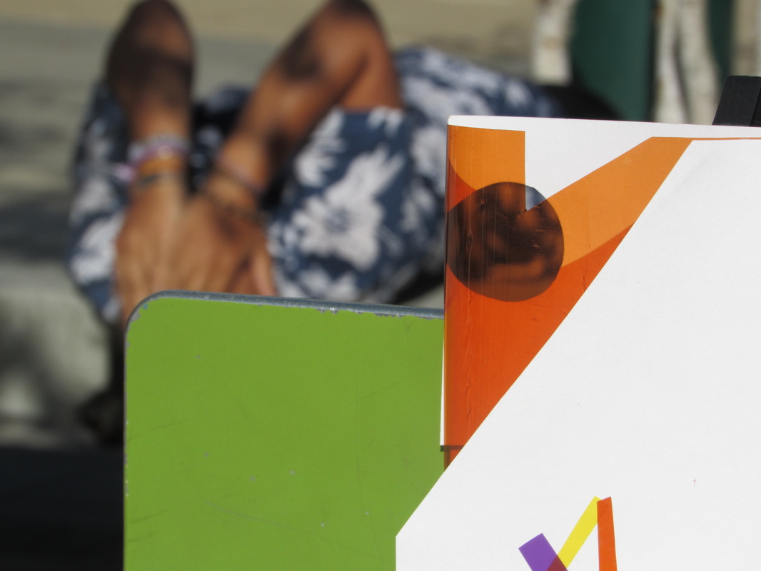
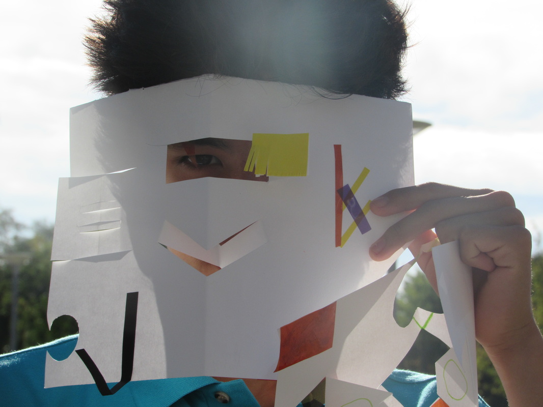
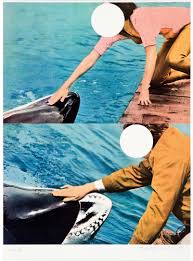
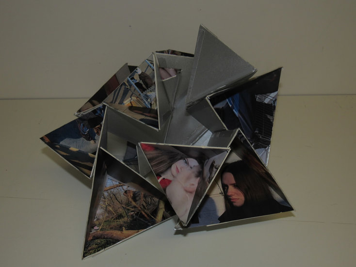
For my final piece I will be creating an abstract sculpture based around triangular shapes and reflections. I'll do this by forming triangular based prism shapes without the base and will be placing images and reflective paper on the the inside and outside of the shapes faces, I will also be painting the 3D shapes with primary colours to bring more abstract features into my piece. My images will be based on the artist Saul Leiter because a lot of my images will be cropped and the colours on my sculpture will be inspired by John Baldessari.
|
I will be basing my piece on the sculpture above, but, instead of the colourful inside of the faces i will be cutting out some abstract photos i have taken myself.
|
Final Piece Evaluation
The theme for my composition is based on abstract art as well as abstract photography.
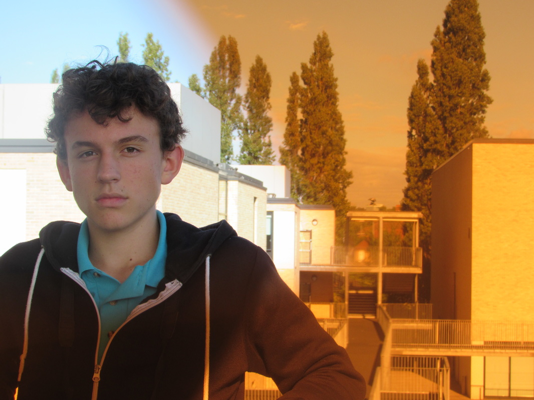
I chose to base my images on the same two models throughout the piece to present the abstract images on a basic day and the different lighting and backgrounds that one day may consist of. I feel this also makes the images contrast and connect with each other because of the similarity of the models in each photograph but still, the images are all slightly different perfectly presenting the moments of a day.
I chose to create the sculpture out of triangular based prisms, the same as I had written in my plan, but adapted to some of my originals ideas and decided to improve my piece by adding and taking away some of my original ideas. Instead of adding colours to the silver reflective faces of the 3D shape, I left it as the colour silver so that the colours in my images would stand out more and appear more dominant in the piece. I also didn't use as many shapes as i was originally going to use and I am happy with my decision because I feel it brings more focus on the smaller amount of photographs and the detail/grain of each image. The formal elements that i feel are shown most in my piece would be Lighting; because of the different shades and brightness in my photographs, Shape; shown by the triangular shapes my images had been cut into making an extreme crop obvious in each picture also linking to Repetition as this is presented in each image, Tone; presented by the colours of the sunlight and the darkness from the indoor images and also Space; as there is a lot of depth in my images, because of the closeups of the models.
Overall, I am pleased with the outcome of my piece and feel that I have presented each of the elements I wanted to include well. if i could do any improvements would most likely use different materials to stick the prisms of my sculpture together as i had trouble trying to keep it as one piece. But, despite this i feel the composition of the sculpture has worked well and in the end held together nicely.
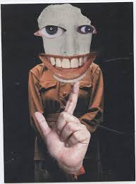
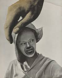
Wandering Bears
|
|
Wandering bears is a creative/photography community made for collaborative projects founded in 2010.
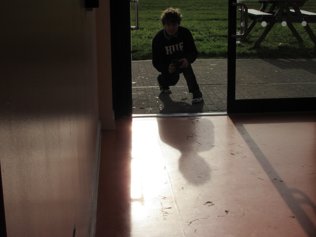
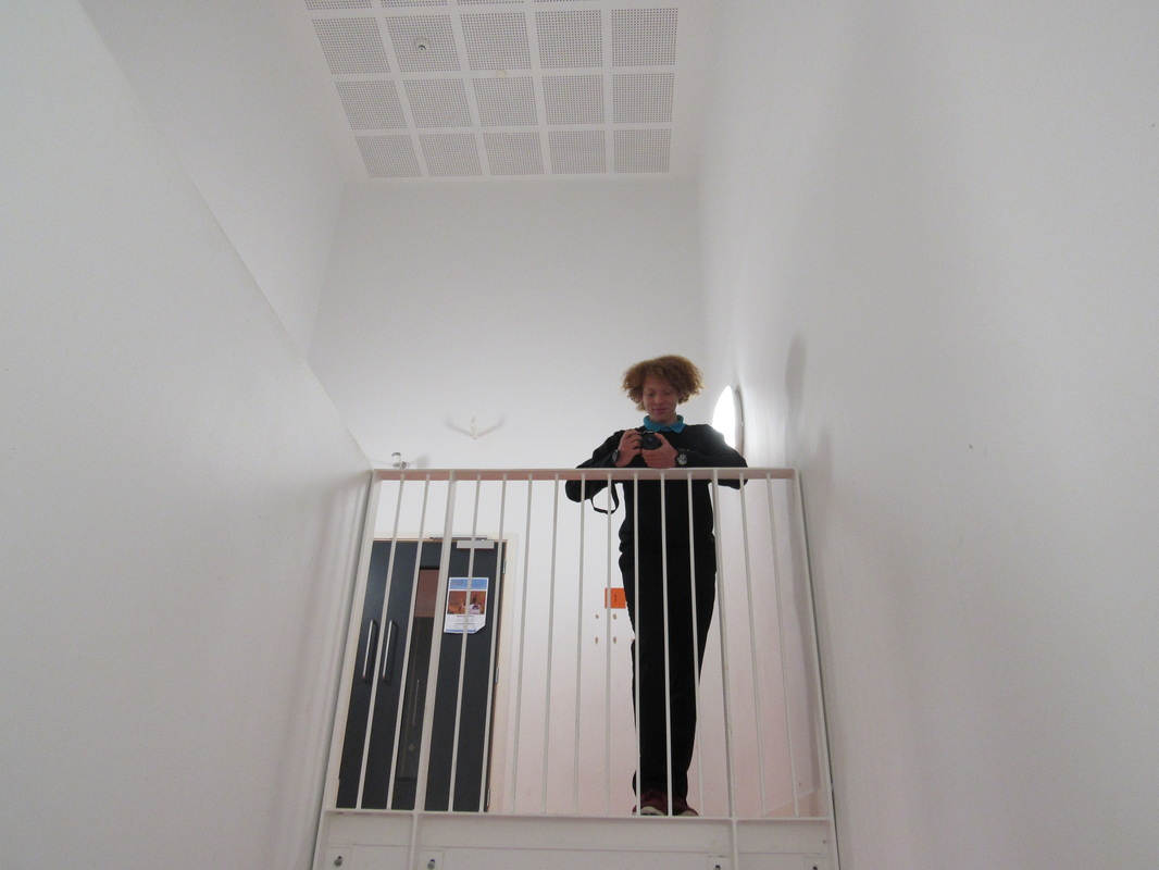
As a class we took part in their 'inside out, upside down' project set up for people to recreate other abstract artists photographs using different materials. At first i wast sure what the project would be like as we were supposed to be using ideas for photographs that weren't our own, but, felt this helped me think more about how i compose my images rather than just taking photographs. |
