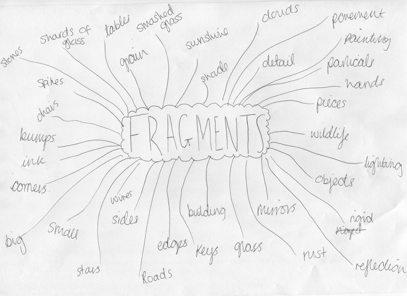
Fragments
Personally, Fragments came across to me as a subject that really focuses on the detail of images. I chose to create my piece on this because I'm hoping it will create something different to my other two pieces (Abstraction and Edges) despite it still being related to abstraction. Fragments also seems to be quite a challenging subject as its often difficult to capture small detail and make it the centre of the piece. However, I believe that working on something like this may develop me as a photographer and help me take images in new ways.
Duane MIchals
|
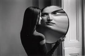
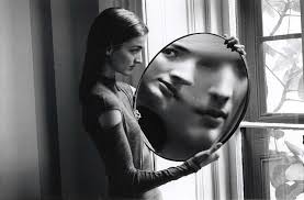
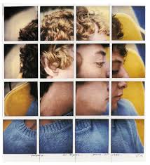
Duane Michals stood out to me most when researching artists focusing on the topic of 'Fragments'. His images consist of using a black and white filter, which I think gives more of an emphasis on the detail. I feel like his use of mirrors was a very interesting and eye-catching idea. The use of the reflection makes the main objective of the image clear to see.
The images to the right are two of my personal favourites of Duane Michals work. Both images are very similar. Because of this, I feel they both work well and look good beside one another. As I mentioned above, Duane tends to use a black and white filter on the majority of his images. This makes all his photographs link to each other as well as easy to identify as his own. What really stands out to me is the use of lighting from the window. It really brightens the girls face to the viewer. This emphases the detail reflected onto the the mirror, as well as the implication of the girl being the main focus. |
|
Lucas Simões
|
|
Lucas Simões looks as tho he tends to make more 3D based sculptures on fragments. What really caught my eye was his use of this 3D burning effect shown in the image to the left. When looking at photographs of people, a lot of emotion can be captured in the eyes. In these images Lucas chose to burn out the models yes which gives a sense of mystery to the persons emotion. For me, this really made me think about what he was trying to capture in the image and what sort of emotions he was trying to represent. If I could present this in my final piece it would show a big representation on the fragment I'm trying to capture. I'm hoping to base my images on someones face and I feel if I use inspiration from this artist it could help me a lot.
|
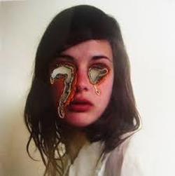
This image by Lucas Simões is one of my personal favourites and stands about most to me for numerous reasons. As explained in the paragraph above, I find that Simões' photographs present a range of emotions because of the mysterious effect of the burnt features. When taking a closer look at each of the images, I found that the one to the left had the most emotion represent as well as the unknown.
When using the burning effect on his photographs, it seems that he's used a pattern of only photographing peoples profiles when creating these pieces.
I've also noticed that Lucas Simões uses a simular lighting technique in a number of his images. He tends to have a dark/dim lighting in one corner or side of his image and gradually has it getting lighter at the other side. This gives more texture to his images and could possibly make the audience notice more detail in the photograph. Overall, I find that Lucas Simões uses different subtle techniques when creating his images that help make the final pieces appear unusual and unique to the viewer and possibly himself.
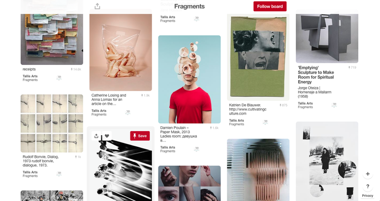
Second Pinterest board
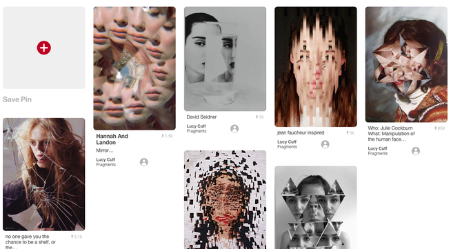
When researching 'Fragments' and 'Mirrors' on Pinterest, I came across the images above. I found that the way in which these pieces were composed struck my interest most. The reflections and cut outs in each image represents fragments through different images and perspectives of a singular thing. This concept of fragments inspired me to research more into various artists that may use colleges or other editing techniques. Down below are a few artists that base there compositions on the idea of combining many into one.
David Hockney
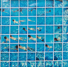
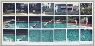
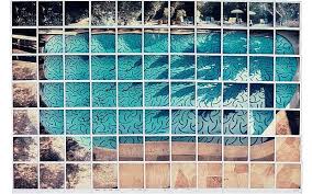
David Hockney uses a collage/cut out style for his images. This stood out to me because of the bright colours and amount of detail in each image, making me want to research the artist in more depth.
Hockney's use of numerous images makes the image appear more exciting and I think this style of creation emphasises on the fragment effect. Finally, I am choosing to base my final piece on Hockneys work. i'll be doing this buy using his effect of lots of images but using more than one photo to do so. Despite the images I'm using being very naturalistic, I'm hoping that I'll give a main focus of fragments in my work due to the type of design I'll be following.
I will be using; Card, paper, scissors and glue.
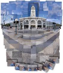
Sohei Nishino
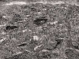
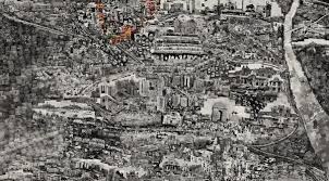
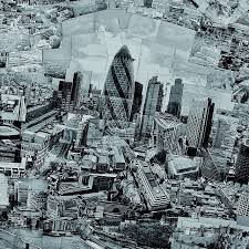
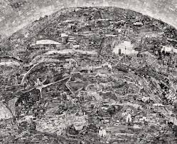
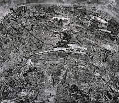
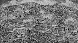
Sohei Nishino, born in Japan, is a photographer. His work involves small detailed images of cities he has visited. Nishino creates incredible collages with these photographs making what appears to be a map of the city he has captured. Despite the lack of colour and simplistic black and white filter, his work instantly took my interest. When looking closer to one of the elements of the final outcome, you get a detailed view of each smaller image he has photographed. Nishino takes a very abstract approach to what he photographs including very industrial compositions of buildings, sculptures and roads. Regardless of the different perspectives, he arranges the images in a way that presents a clear birds-eye view of the cities map. At first this may not be clear to the viewer but the visible lines and shapes make a huge impact to the final work. I think Nishino's choice to present the piece in black and white compliments the image. This draws less attention to what isn't important and gets the viewer to focus more of the abstract of the composition. I think if the image where to be in colour it could appear to overwhelming to the viewer and will take away the importance of the overall design.
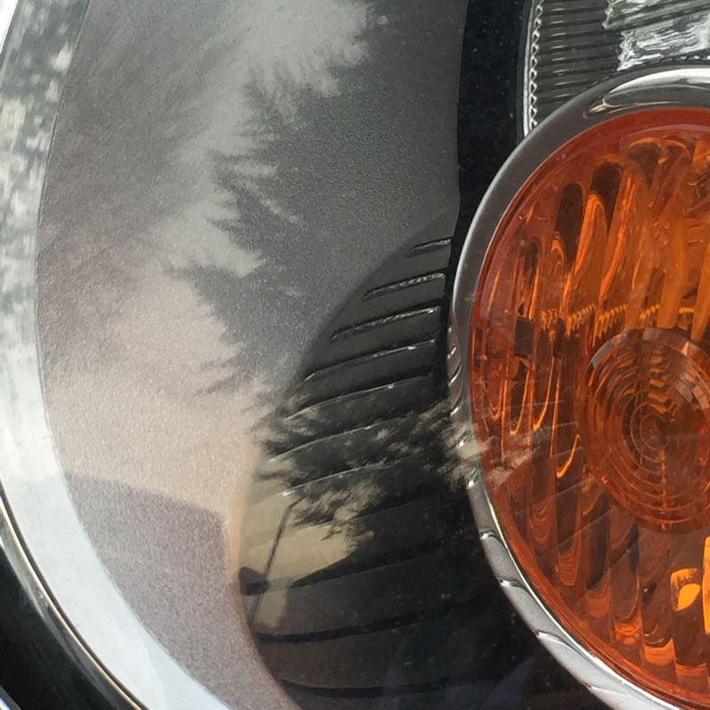
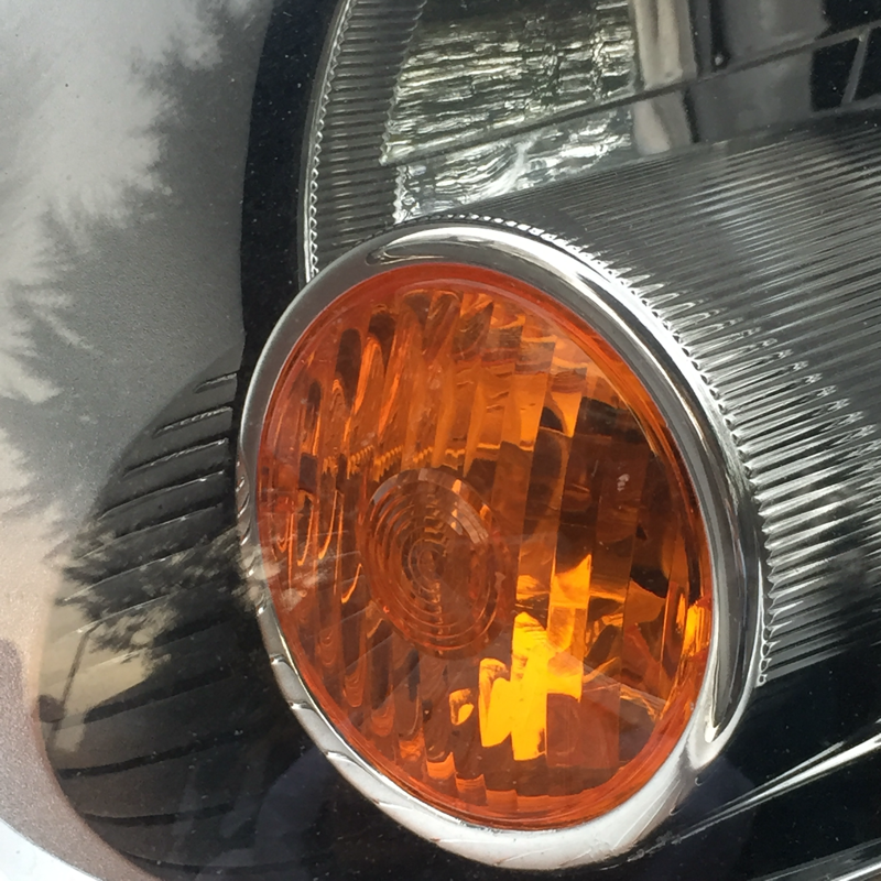
Images
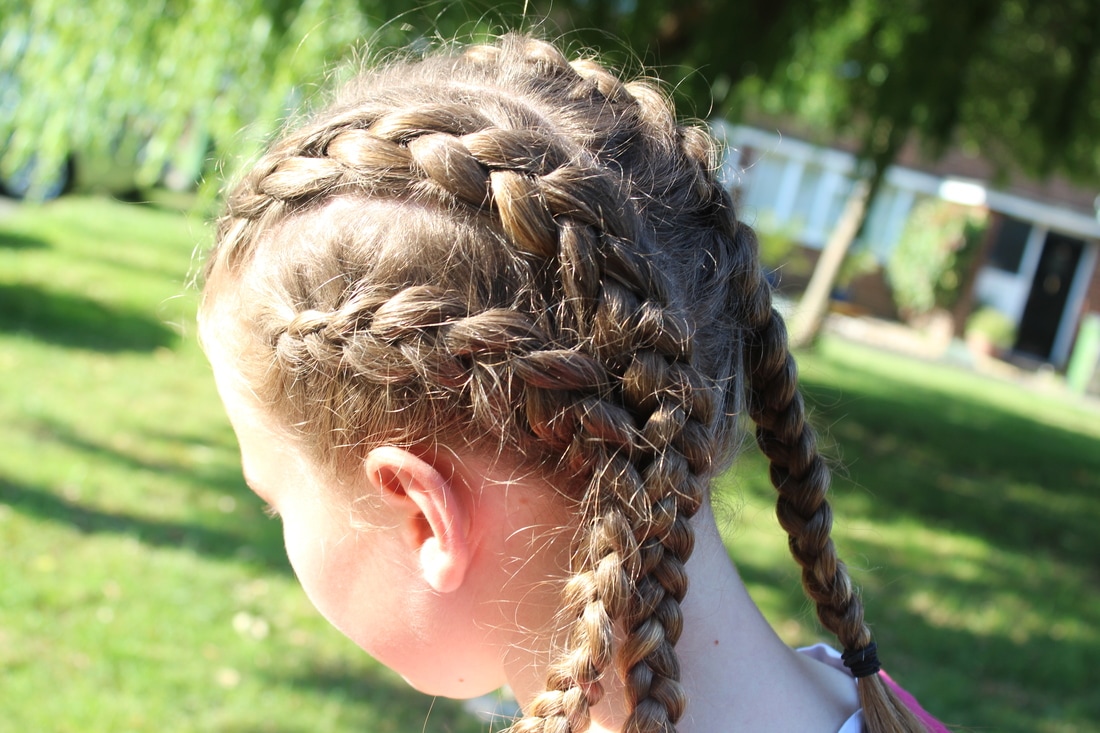
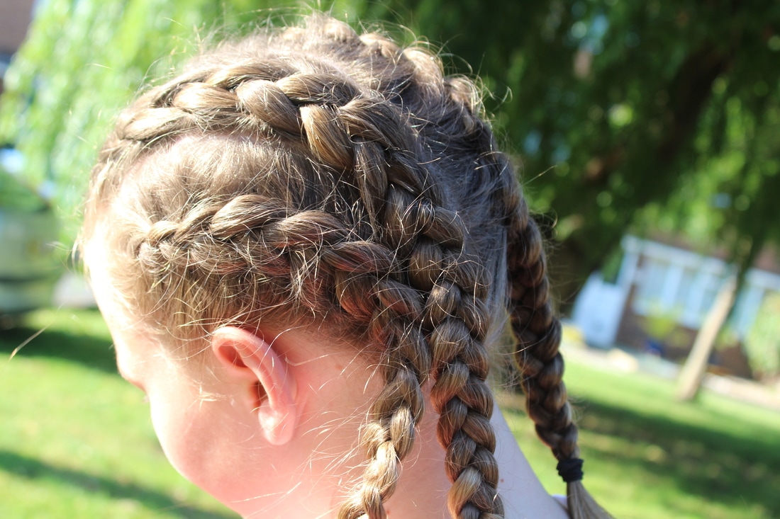
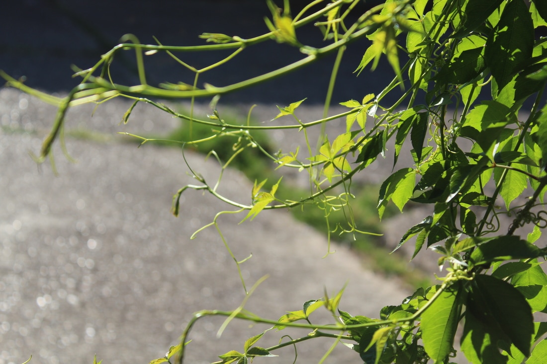
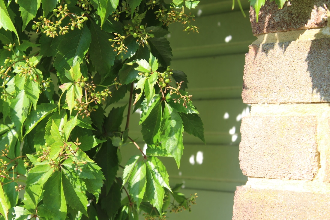
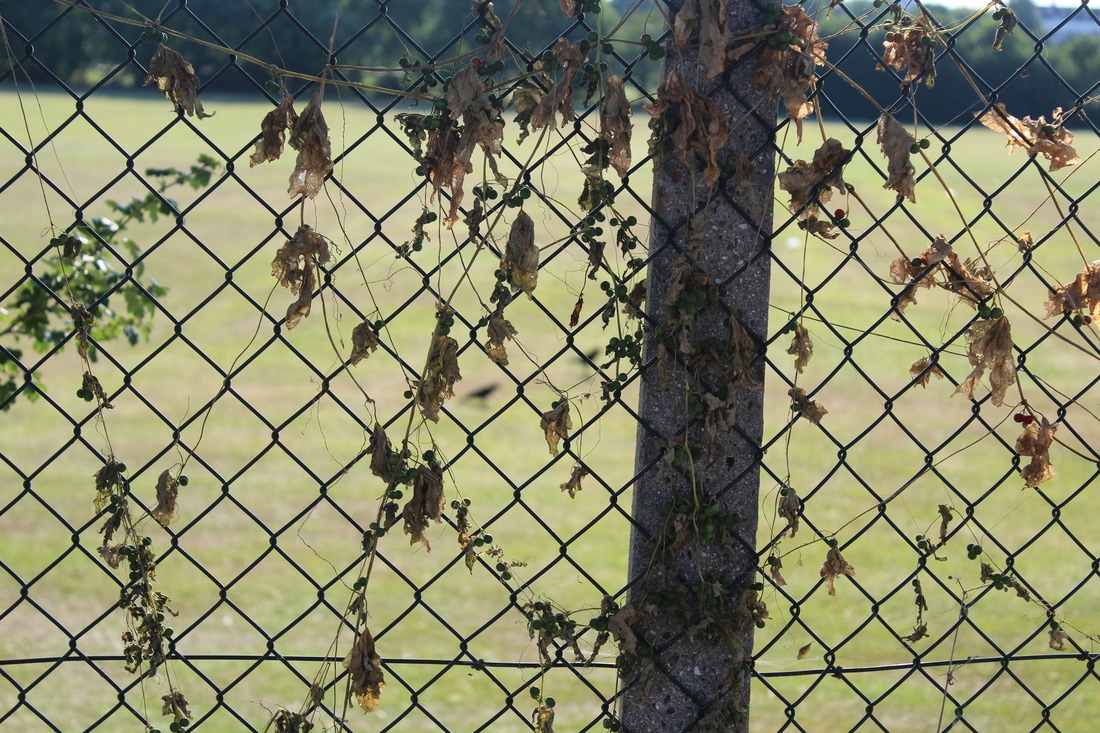
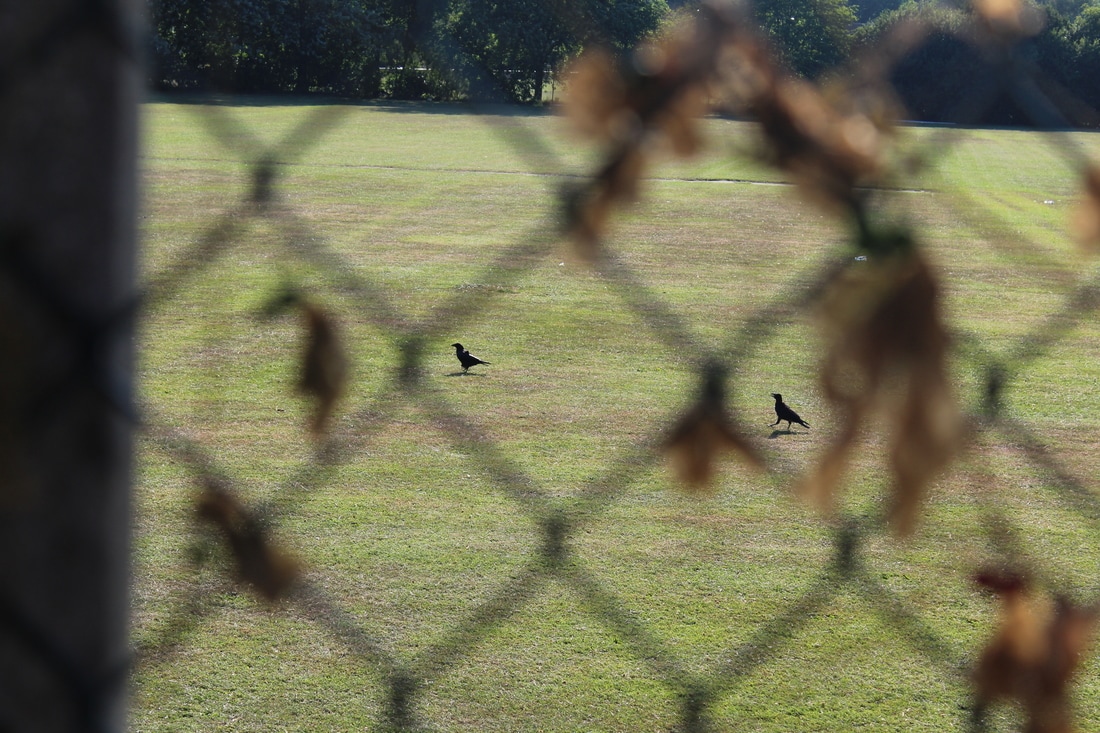
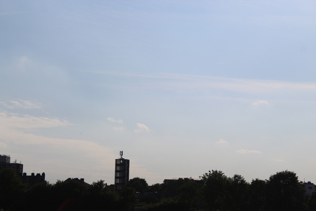
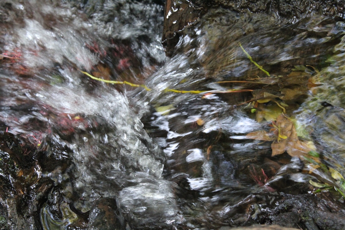
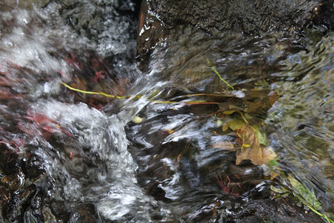
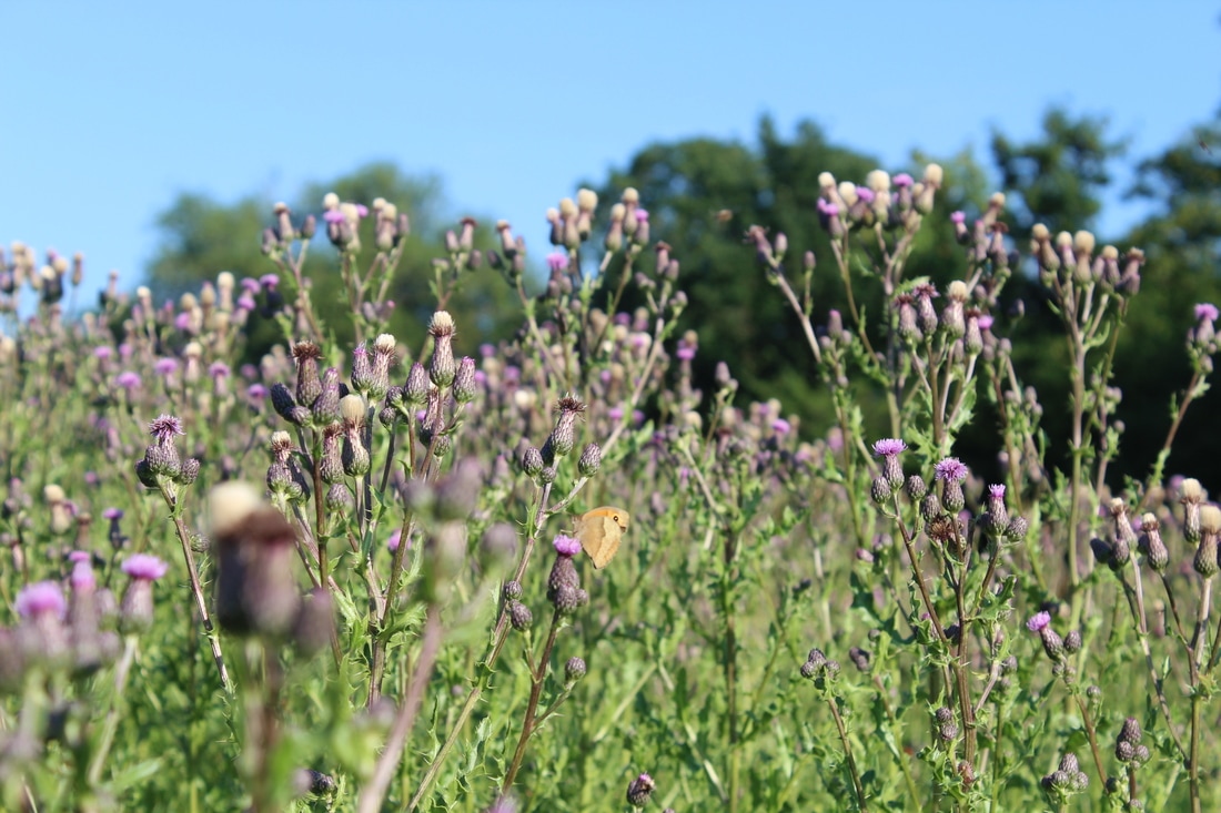
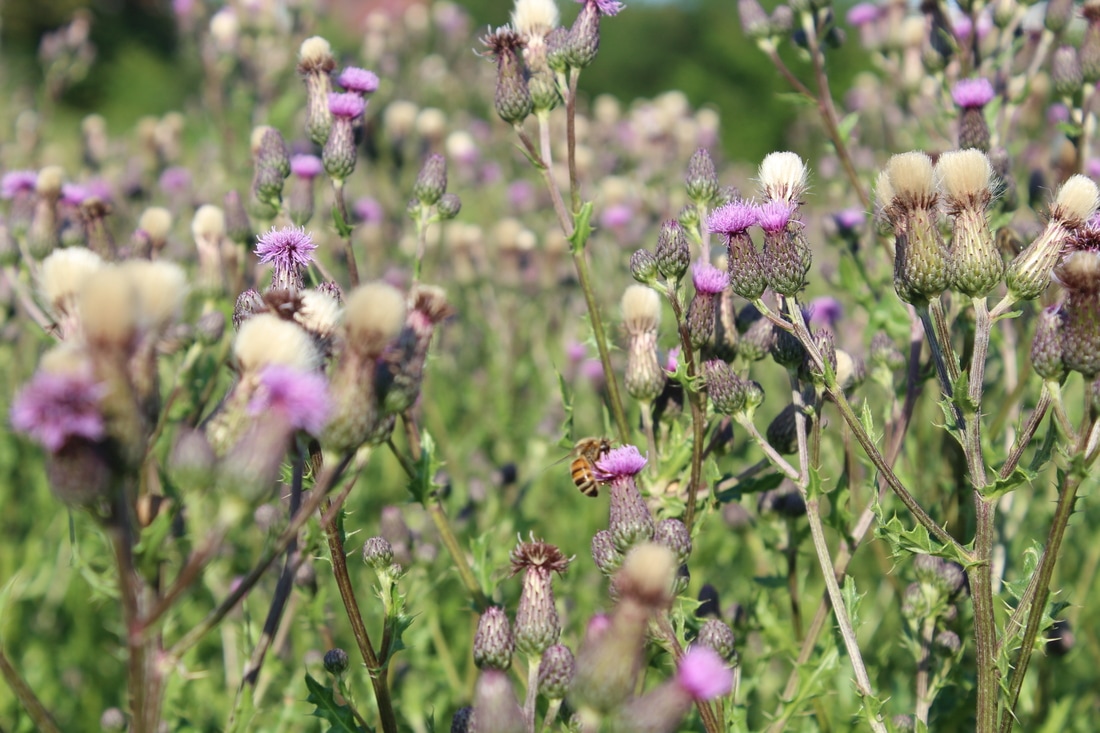
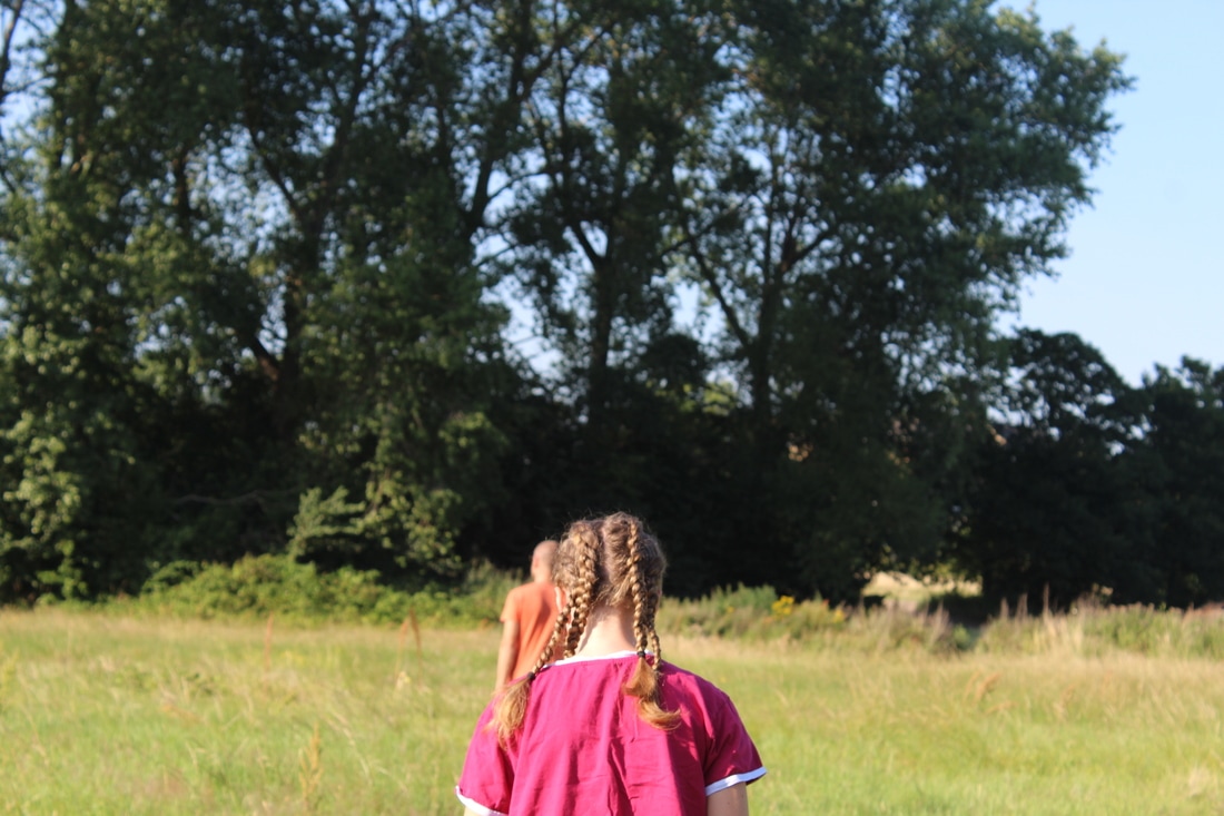
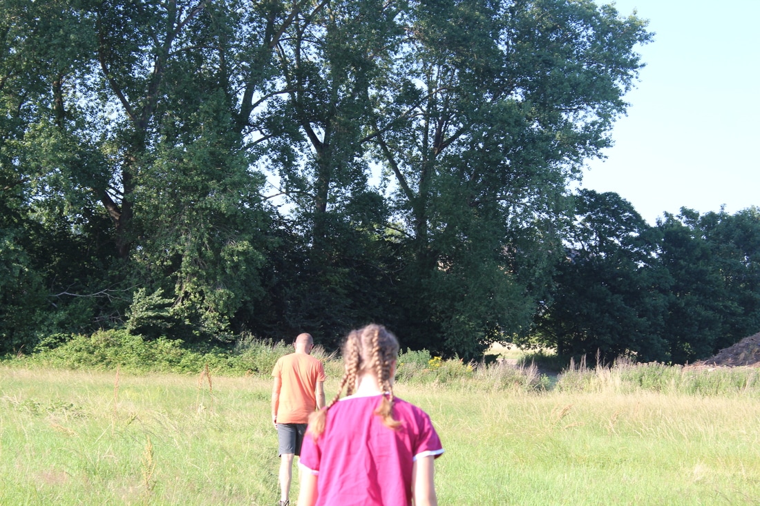
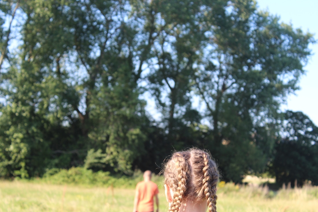
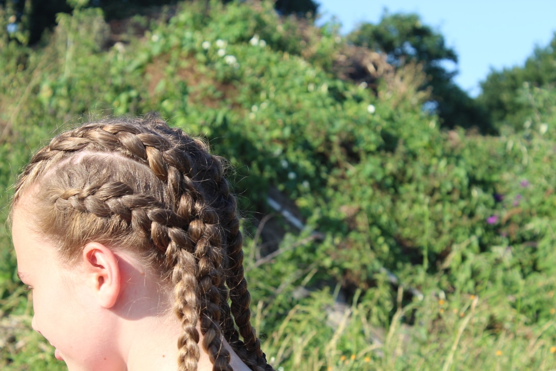
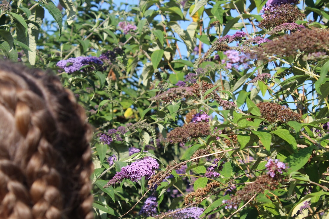
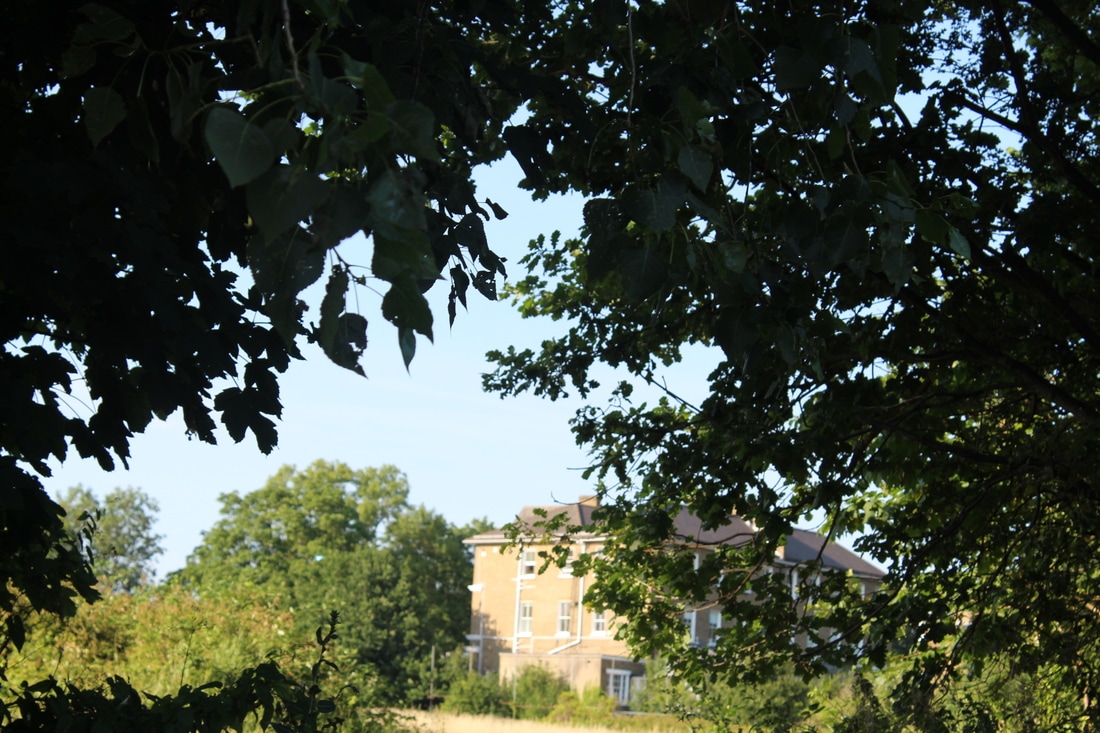
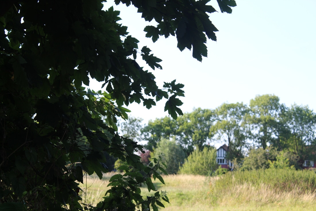
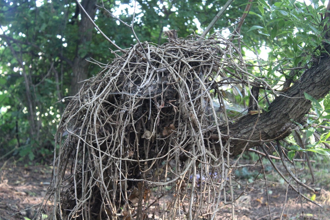
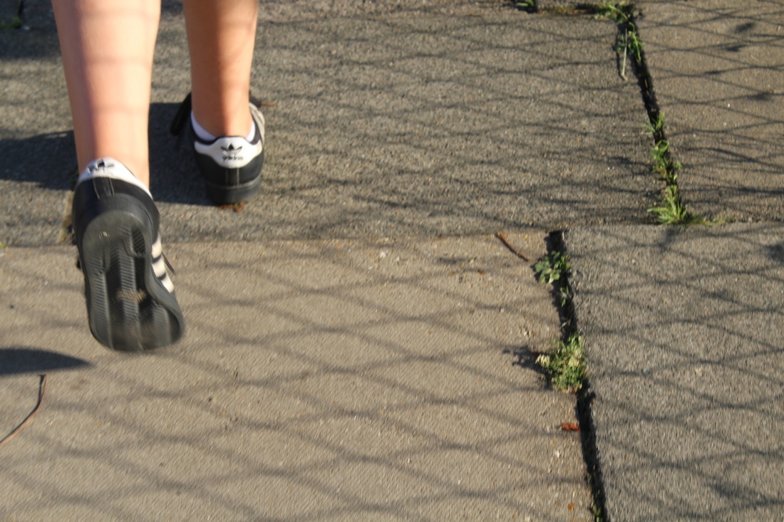
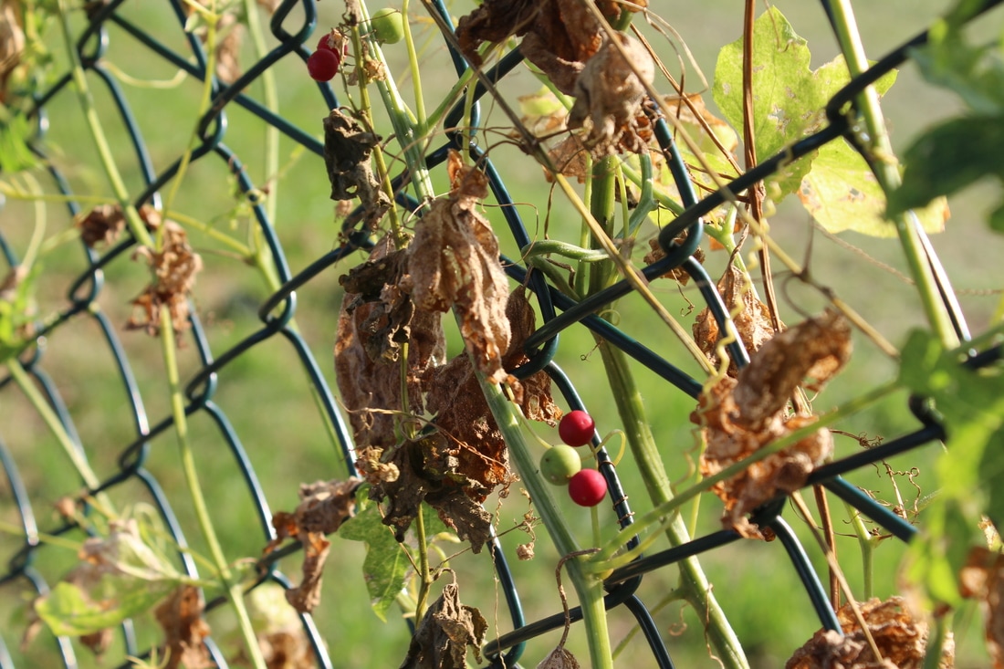
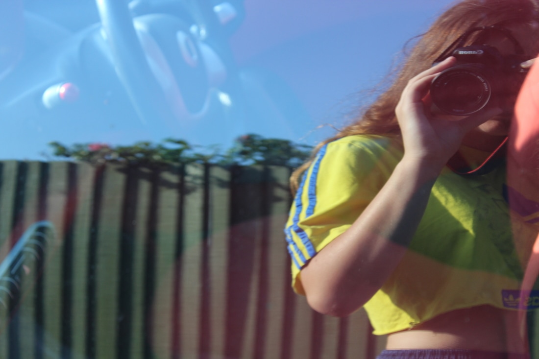
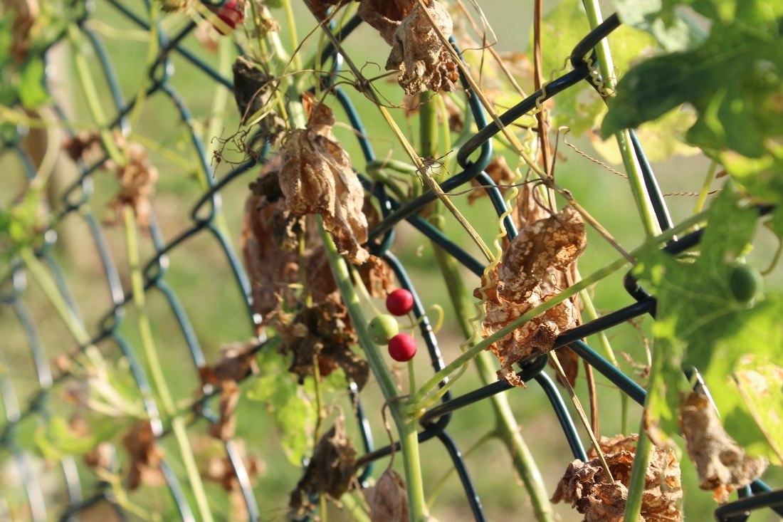
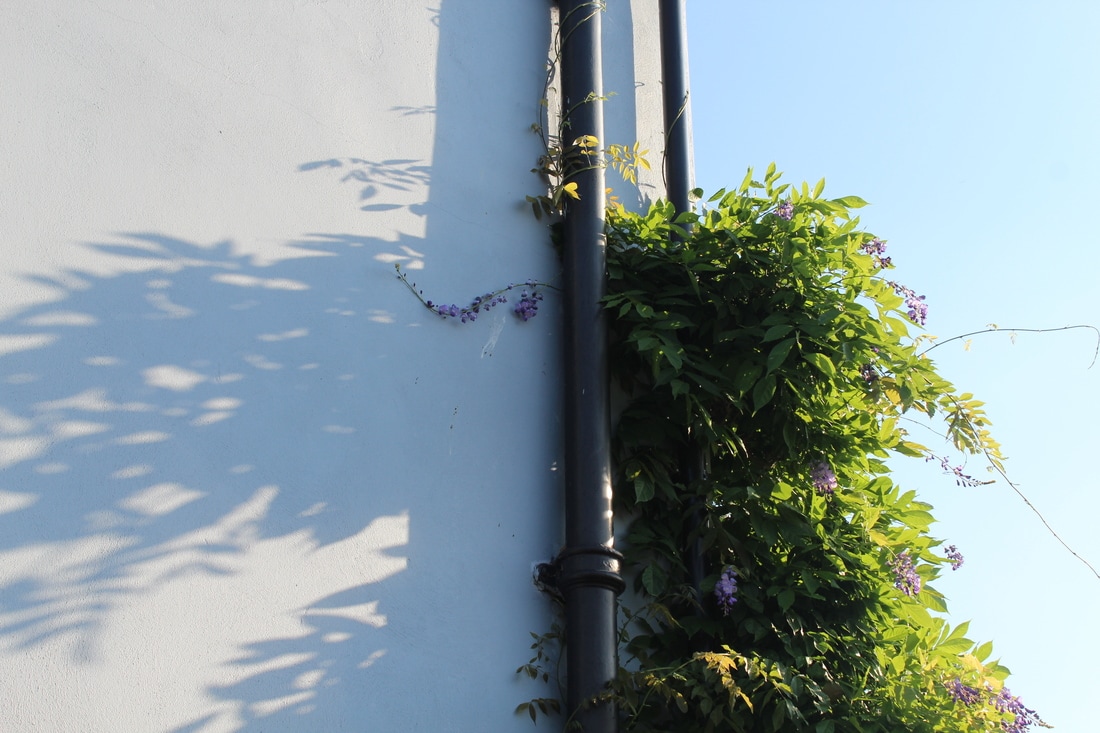
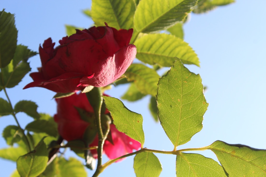
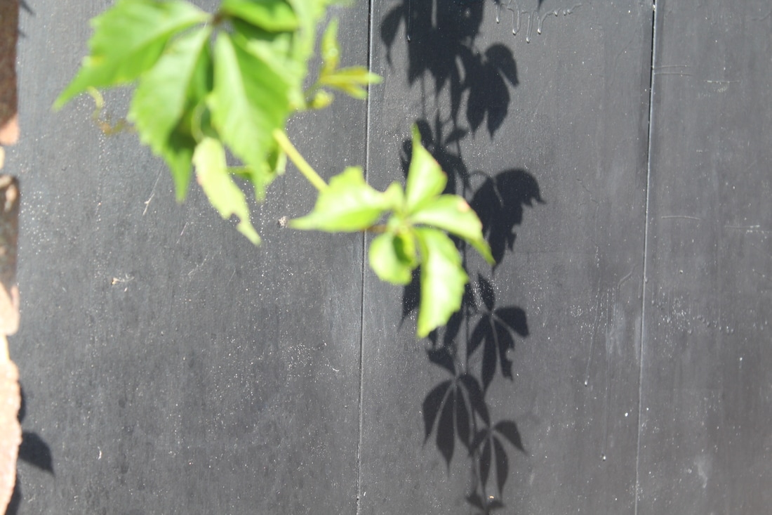
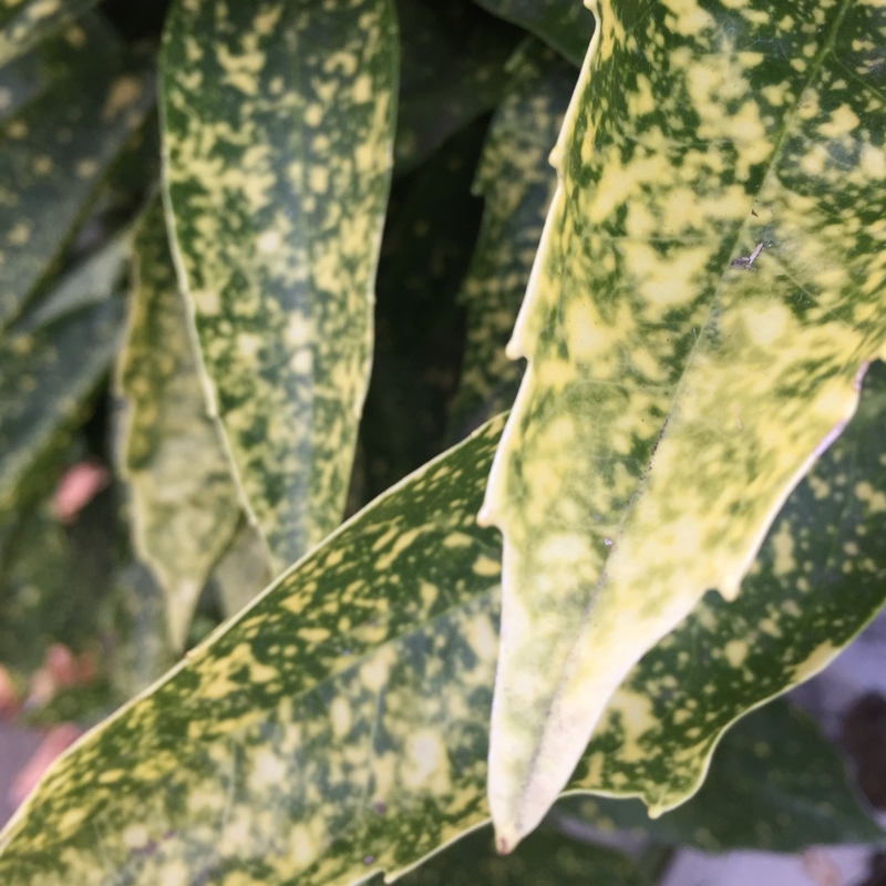
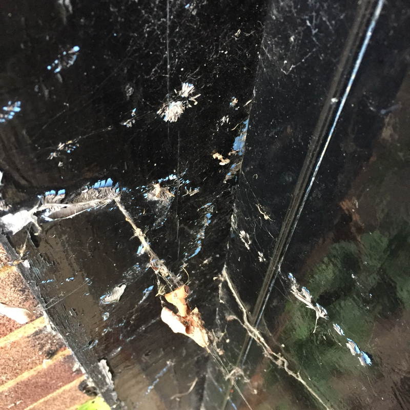
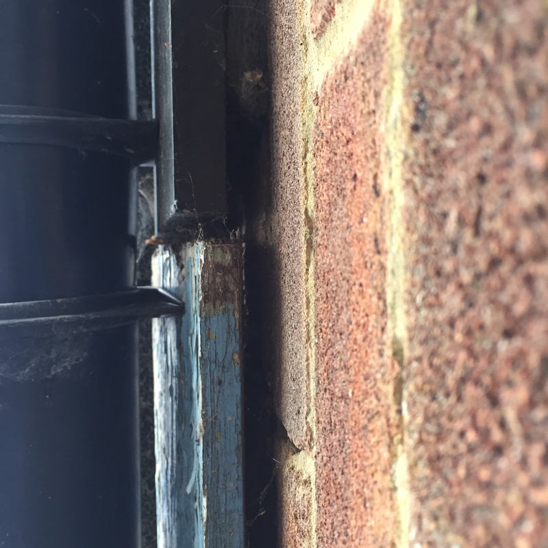
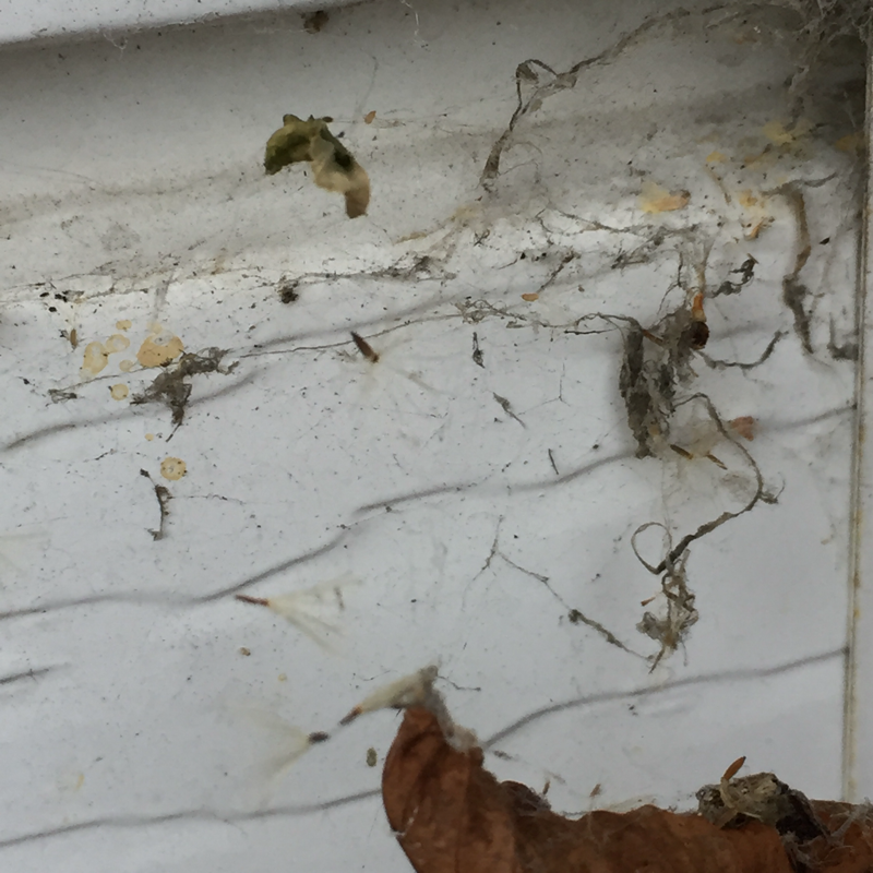
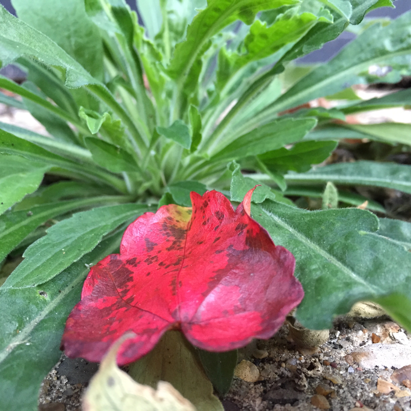
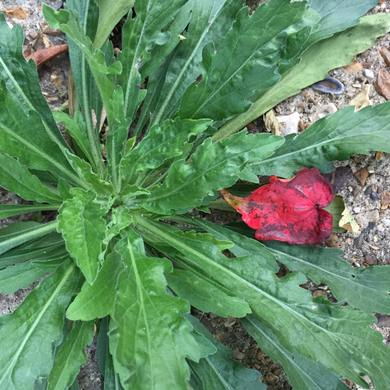
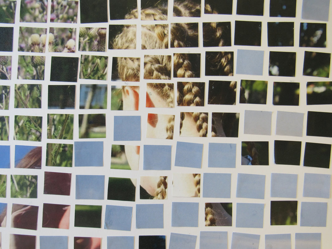
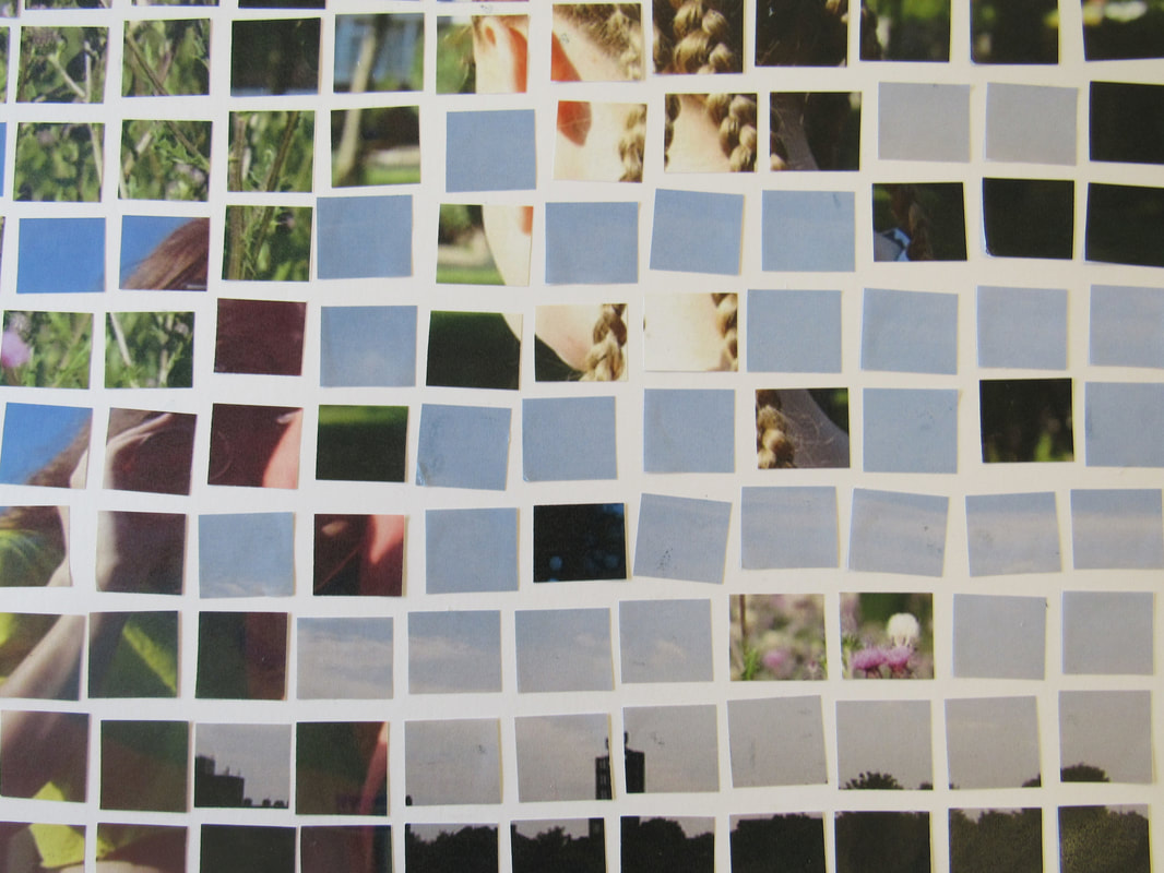
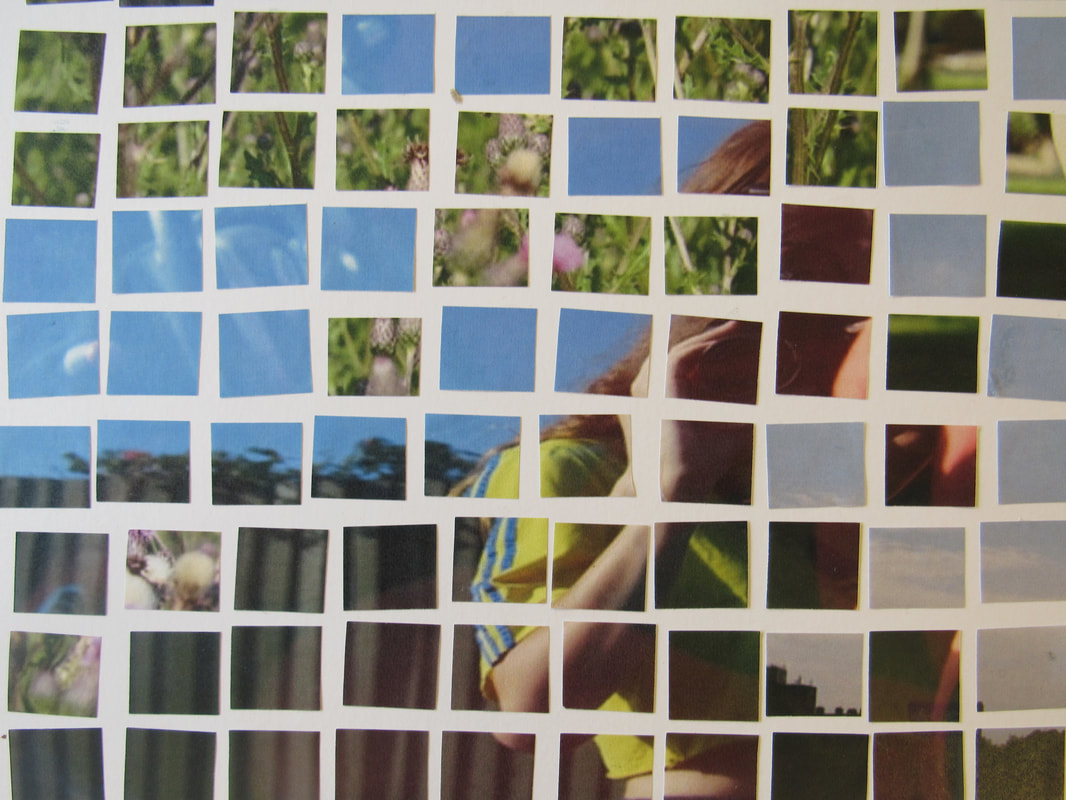
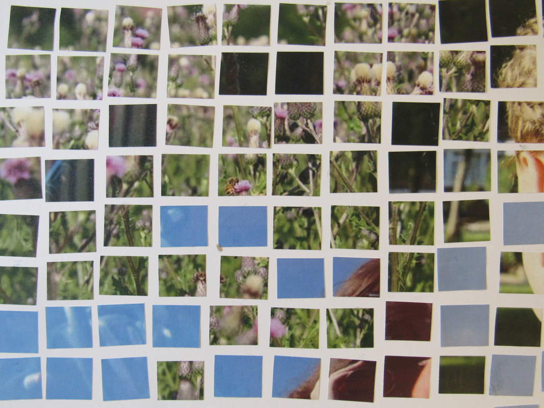
I have chosen to take these images as I feel they can connect to my theme of fragments. Fragments is based on extreme detail of an image and how it is presented. Each of the photographs above have an obvious detailed fragment, therefore the way I'm going to develop these images will be be presented in my final piece. I wanted to present fragmentation in these photographs through bright colours and detail of natural objects. Each of the photographs have similar colours and lighting which brings them together in a way that they're pleasing to the eye. I took these photographs on a high exposure making them bright and emphasising the colour. In my final piece, I'm hoping that all the detail of the images which be presented in the small squares I have cut them in. This composition will also be in the style of David Hockney, also relating it to the theme of fragments.
Experimentation 1


The four images above are a few favourite I took. To expand and develop these images, I'd like to use them in my final part of this experimentation
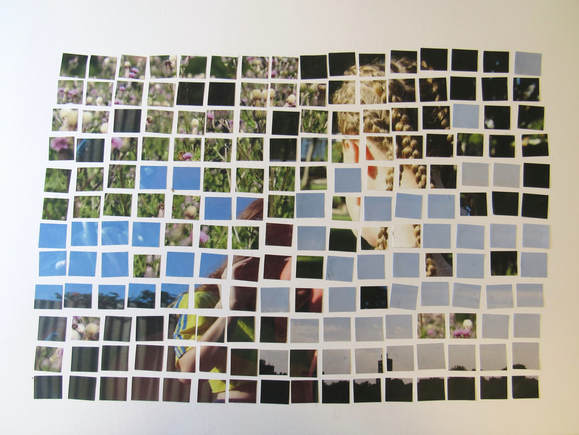
Overall, I think that my composition has reflected what I wanted to present. I feel that it has illustrated fragments in the way I intended to and in a developed way. As I have been saying through my experimentations, I developed my idea off of the artist David Hockney. He chose to present fragments in a collage type way but only using one image or the same thing photographed more than once. However, I chose to use more than one different image. I'm hoping that to the viewer my composition has portrayed fragments in a more abstract way, focusing on the small details of the whole image rather than just one detail. Each square symbolises one small element of the photograph and makes people look at 'the bigger picture' in a broken down way. Combining the small squares makes the image more interesting to the viewer and can generate questions wondering which square goes with what.
What I find mainly stands out in the piece is the colours and shapes included. the contrast of the yellow, blues and the purple tend to make the image more eye-catching as well as it giving a block coloured/abstract feel to it. The different lines and shapes in the overall composition takes the viewers eyes through different paths of looking at it. As it first has quite a confusing look to it, the viewer may try and find connections between the shapes. The gaps between the cut outs leave a defined line between each of the squares, also making the effect of what the piece is trying to preform more easy to spot.
What I find mainly stands out in the piece is the colours and shapes included. the contrast of the yellow, blues and the purple tend to make the image more eye-catching as well as it giving a block coloured/abstract feel to it. The different lines and shapes in the overall composition takes the viewers eyes through different paths of looking at it. As it first has quite a confusing look to it, the viewer may try and find connections between the shapes. The gaps between the cut outs leave a defined line between each of the squares, also making the effect of what the piece is trying to preform more easy to spot.
Experimentation 2


In my second experimentation I'm going to try using a more digital, photoshop approach. Still sticking with my idea inspired by David Hockney, I'll be attempting to create a similar effect to my first experiment but with a better composition and variation of shape sizes.
I experimented a few times with photoshop but felt it didn't present the kind of image I wanted to create. Therefore, i didn't carry out too far in this experiment as other ideas from this came to mind, such as focusing on a new artist. Despite the images being of fragments, when looking at the image this theme doesn't stand out to me. As well as this, the overall effect of the composition doesn't link to David Hockneys design. I personally found using photoshop more difficult and not one of my strengths, therefore the overall compositon of this experiment didn't reach war i wanted to accomplish and I'm disappointed with the outcome.
Experimentation 3
Relating to Maurizio Galimberti and David Hockney
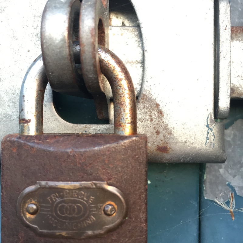
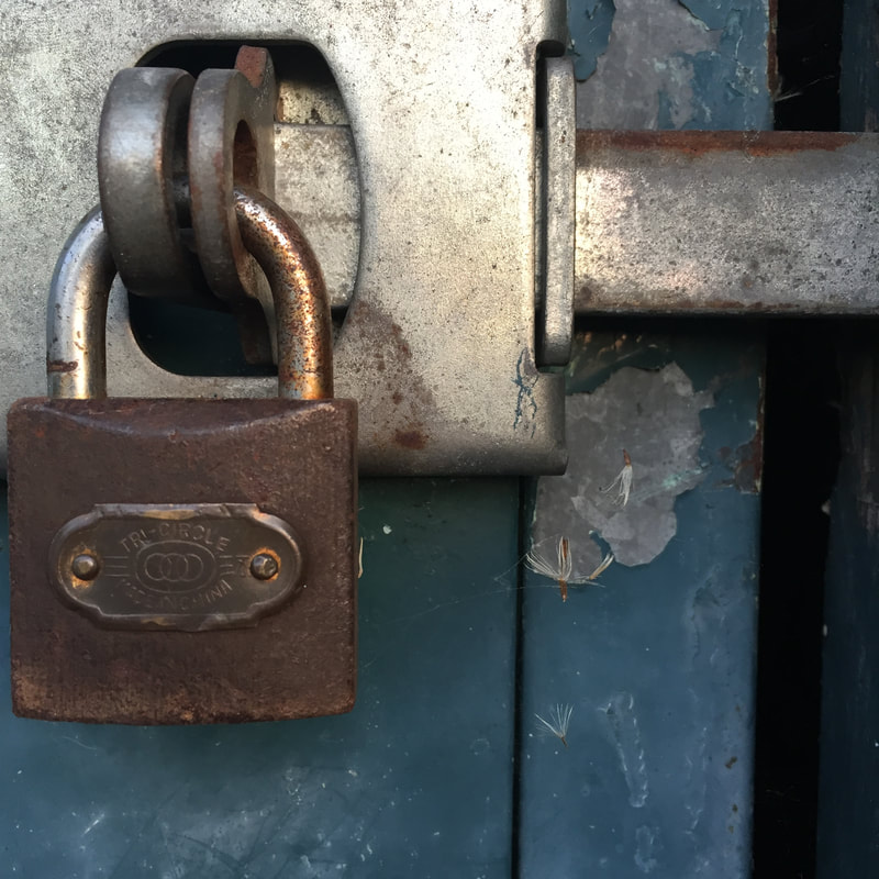
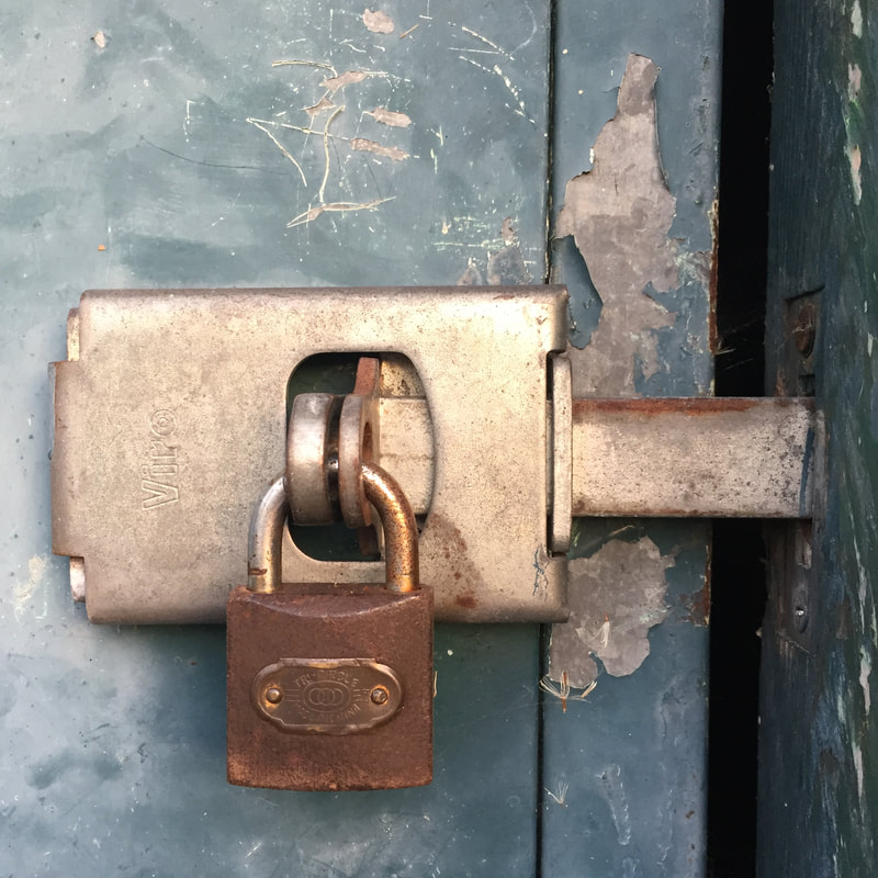
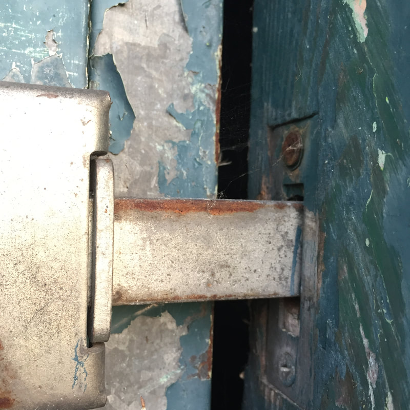
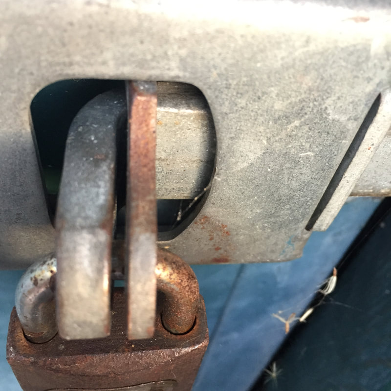
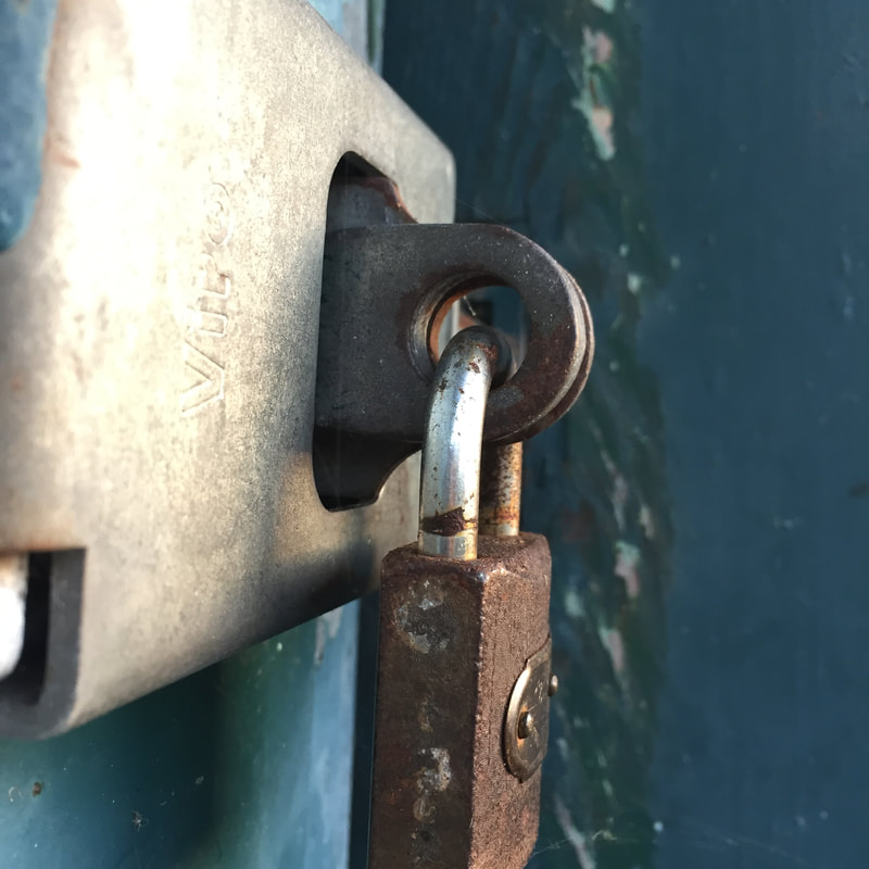
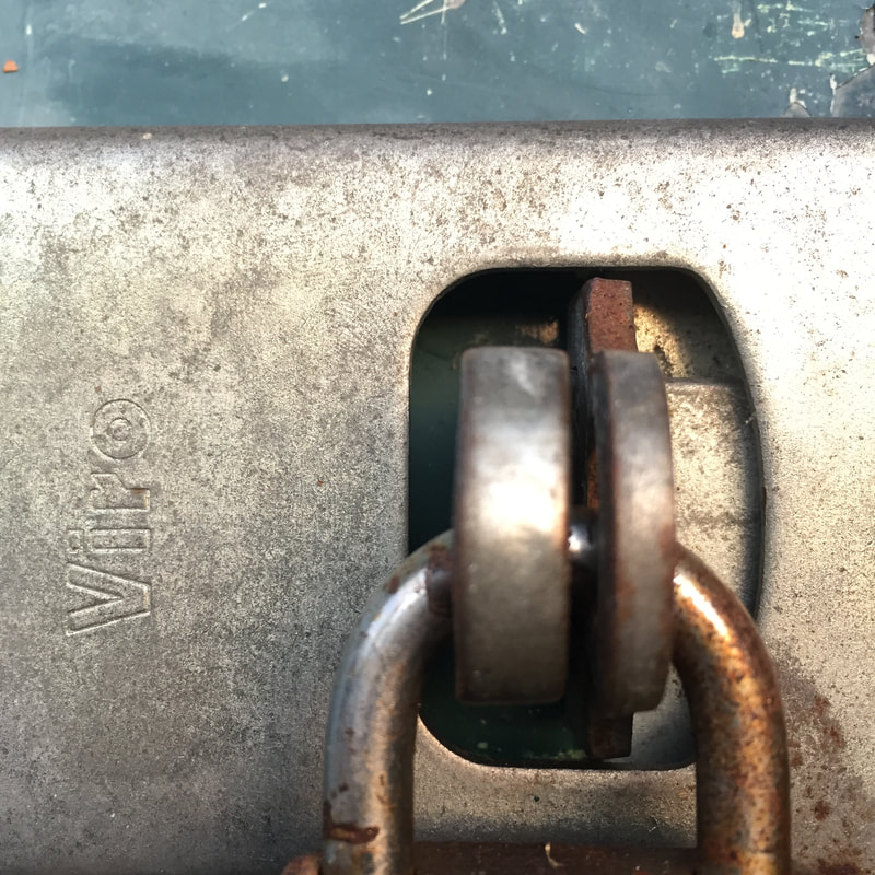
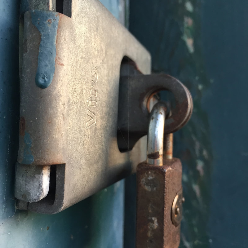
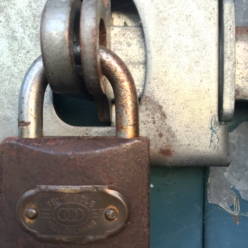

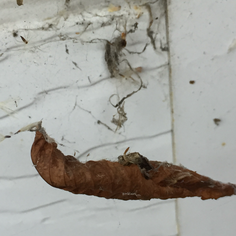
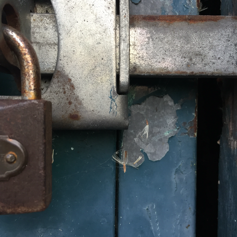
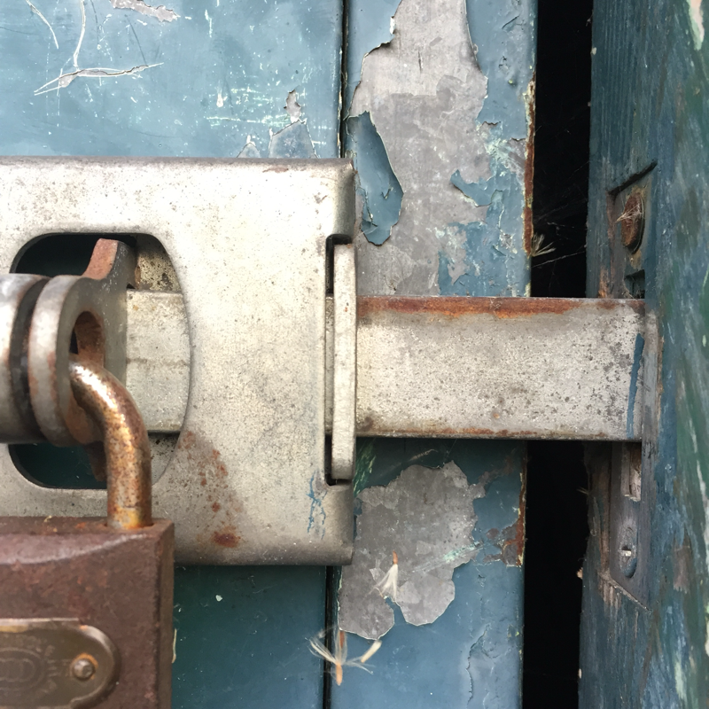
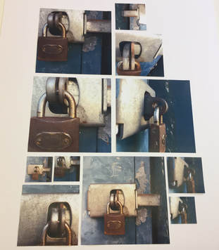
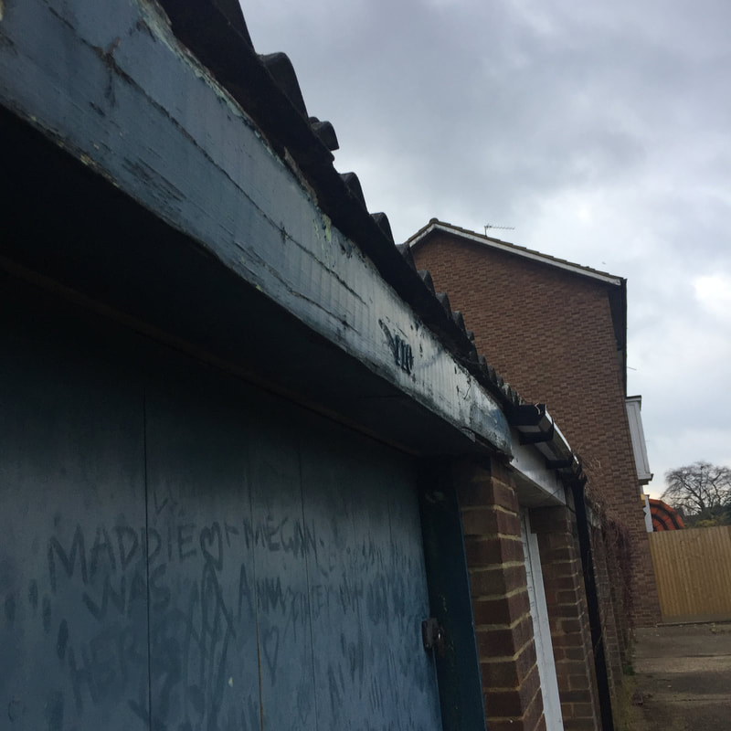
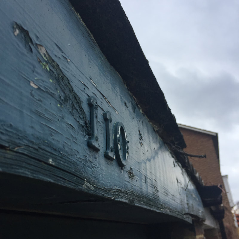
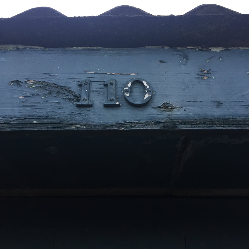
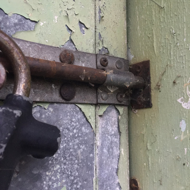
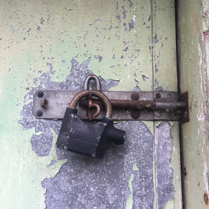
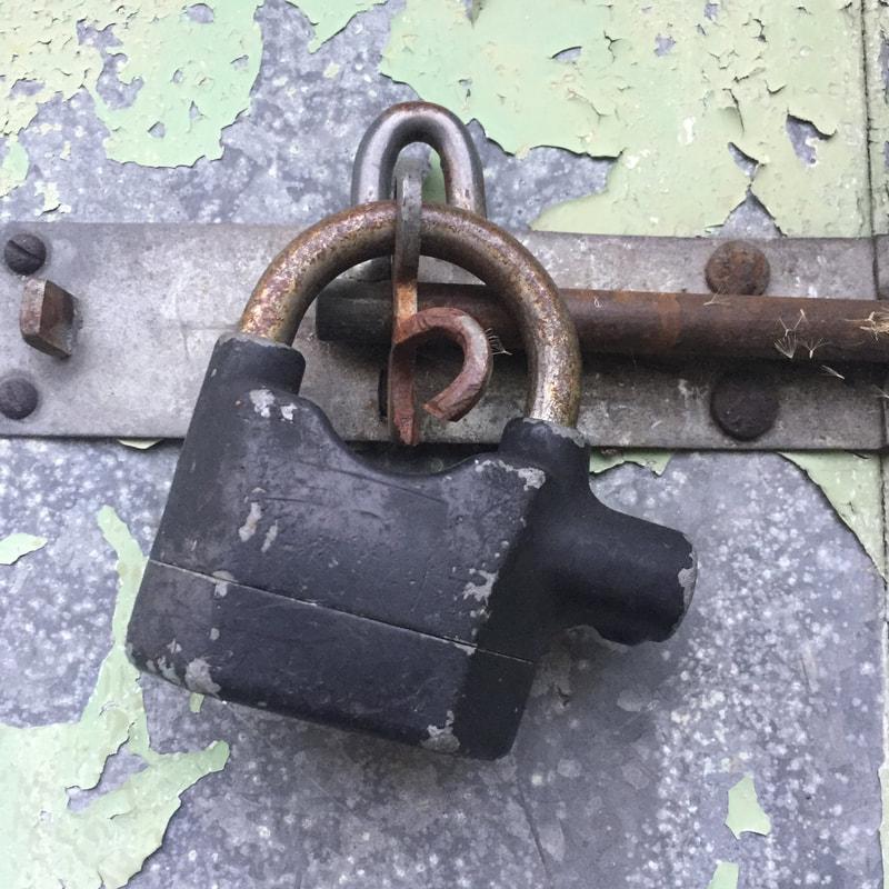
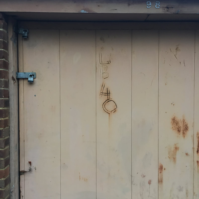
For this experimentation, I was inspired by both Maurizio Galimberti and David Hockney. I chose to focus on how both artists take images of the same thing. What I have chosen to do is take numerous images of a lock. The reason for this was how the detail of the rust, decay and deteriorated paint. When taking the images, I chose to take the photographs from different perspectives of the composition, which also links to Sohei Nishinos idea of different perspectives of fragments. The photographs in the slideshow are all of the images I have taken and the ones beneath are the images I'm going to use for further experimentation on the project.
|
I decided to print and cut out the images in 3 different sizes for the photographs. I have chosen to make the full images of the lock as a larger print and the smaller prints to be more close up or cropped. The reason I have done this is to emphasise the different perspectives of the lock and its aspects. To the viewer, combining these perspectives could make the fragmentation of the object clearer as well as a new prospect on simple items. Later, when arranging the images, I am hoping that it will clearly represent the different fragments involved in the photograph. To improve this, I'm going to experiment with different levels of presenting the lock. I hope this will introduce more detail on how the viewer sees the piece.
To the left is a rough representation of how I want the outcome to look. |
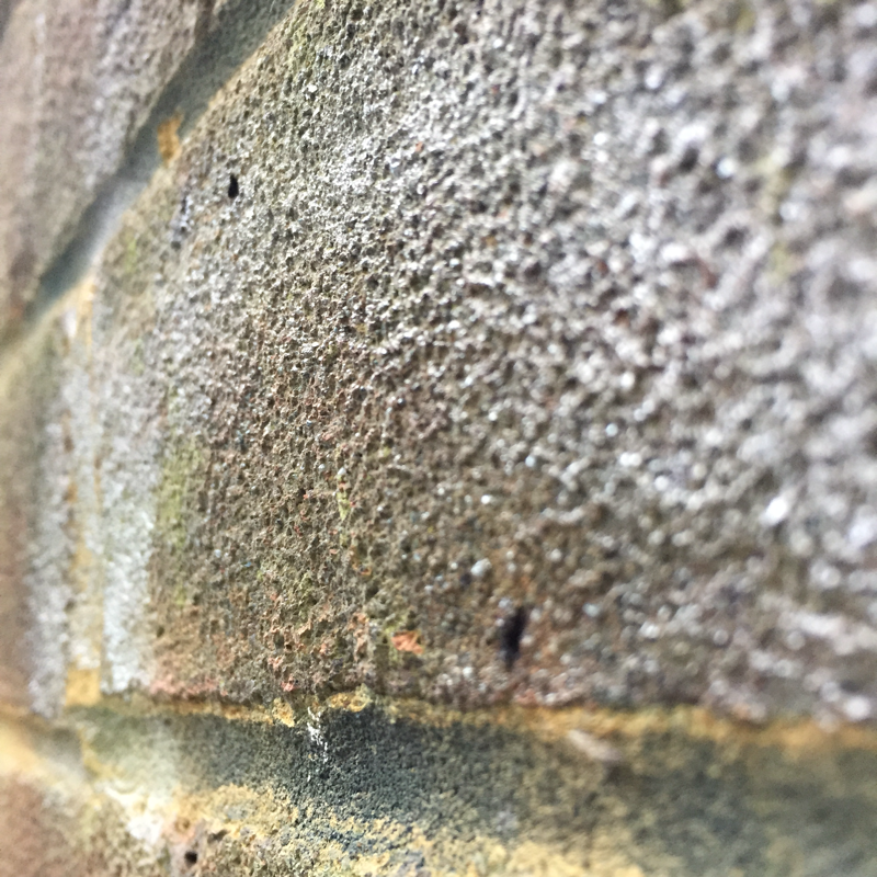
Overall, I am satisfied with my final piece to this part of my experimentation. I feel it has presented fragments clearly when the viewer looks more closely at the composition. The colours of the images give an industrial/mechanical look from the tired blue and bright bronze/gold of the lock. As well as this, an important element to the images is the lighting. I took these images around late-midday and therefore gave a yellow toned brightness to the photograph. This is presented in a reflection on the lock. In addition to this, it enhances the detail and grain of the rough exterior of the garage as well as the lock. The piece as a whole is simply a combination of perspectives. If I were to improve this piece, I would have the outcome on a bigger scale by printing lager images and having a bigger mounting board. The reason I would do this is because I think having the small lock exposed on a bigger scale would have an impact on the representation of the small fragments.
Experimentation 4
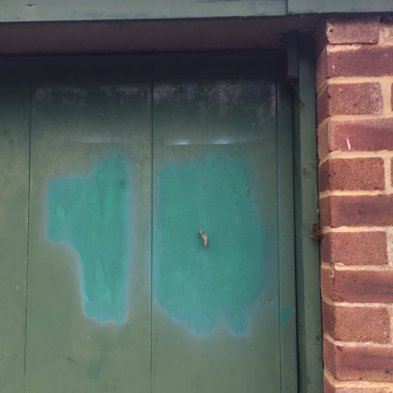
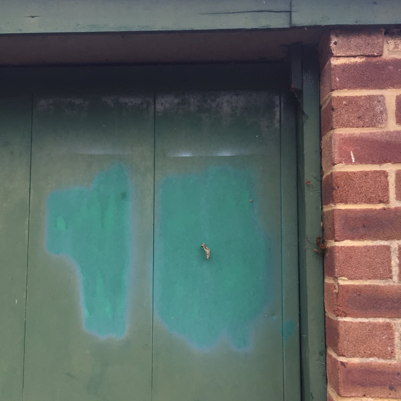
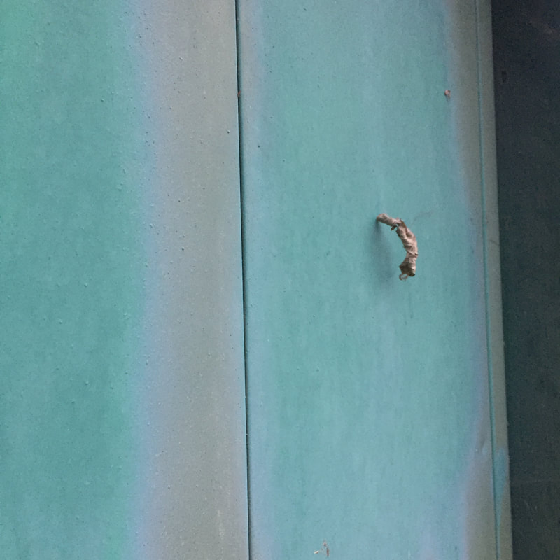
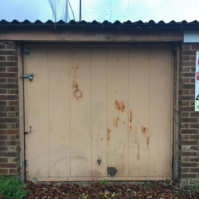
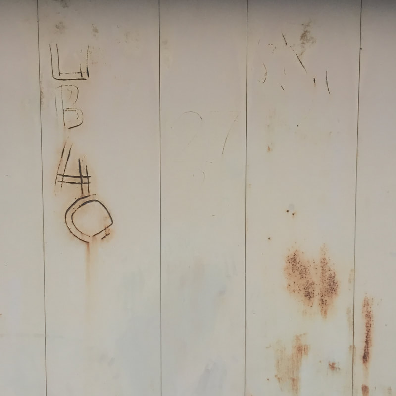
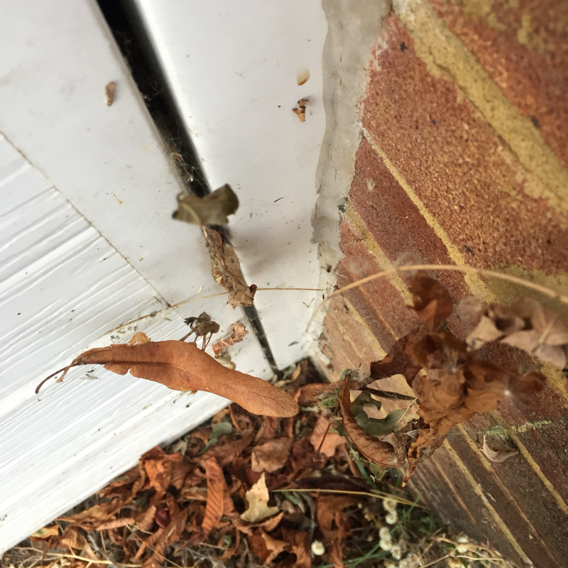
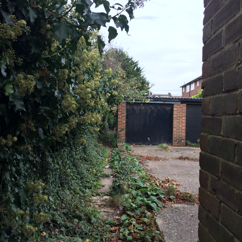
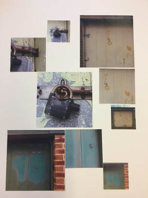
For this experimentation, I have approached it similarly to the one before. This time, I chose to take different perspective photographs of different objects. The theme of my images appear to be industrial fragments and I feel this makes the images work well together despite them being of different things. One of my main inspirations for taking pictures of different items is the artist Sohei Nishino. Although not following his way of presenting images, I've taken inspiration from the urban areas he recreates. I felt this was a good area to focus on fragments and photograph as the damage of the garages had a a lot of detail. Above is a slideshow of the images I have taken and underneath are the ones I'll further use in the project.
|
To the right is a rough layout of how I would like the outcome to be presented. At first I was going to use 4 different groups of images but then later changed to 3. Similar to the experimentation before, I chose to print out 3 different sizes of each image. In the piece before I presented the different lock sizes by having some some presented popping out of the image. Alternatively, the way i have chosen to lay out this composition is through a window effect. Instead of having only some photographs this way, all will be like this.
|
|
Overall, I feel I succeeded in what I was trying to achieve in this part of my experimentation. Each image links in the way that the fragmentation has been noticed in similar environments. These environments being an industrial/warn out location. Also, I feel the general contrast of each weathered colour presented in the images gives a final effect of enhancing the grain of the photographs. Lastly, the layout of the windowed images gives a simplistic finish to the detailed depiction. If I were to develop this piece, I would possibly add more images or have my original ones presented on a bigger scale. This would be because the original images are too close together and having them more spaced out would amplify the contrast of the photographs. For example, the washed blues and greens would have more of an impact on the idea of fragments.
Experimentation 5
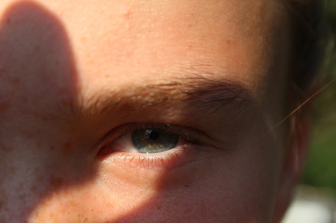
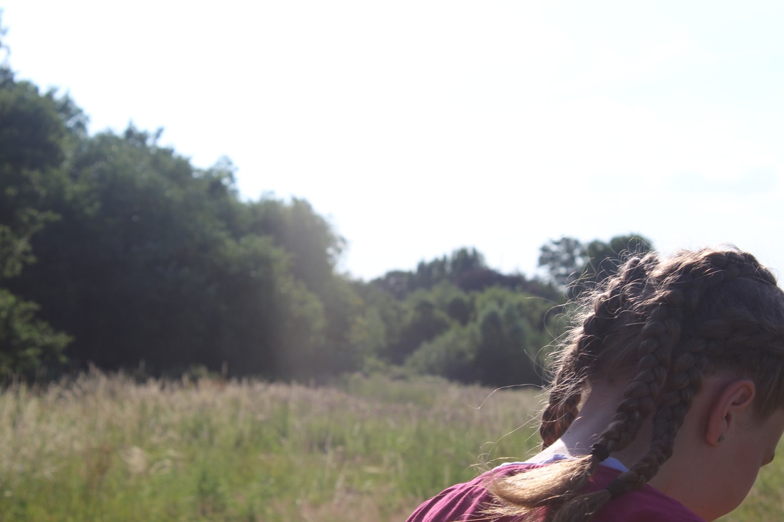
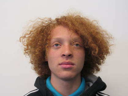
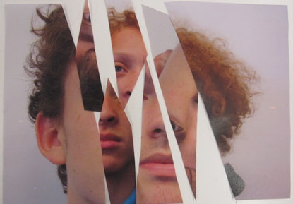
After evaluating what I've done so far and how my compositions have turned out, I've now decided to try creating a piece inspired by the artist Lucas Simões. Simões uses a range of techniques to represent fragmentation as I spoke about in my evaluation of his work above. I found that he mainly focuses on taking images of peoples profiles so I will be taking this into account with my own experimentation. As I enjoy photographing peoples faces, I'm hoping the minimalistic approach to whats in the image will help have a bigger impact to the fragments in the picture.
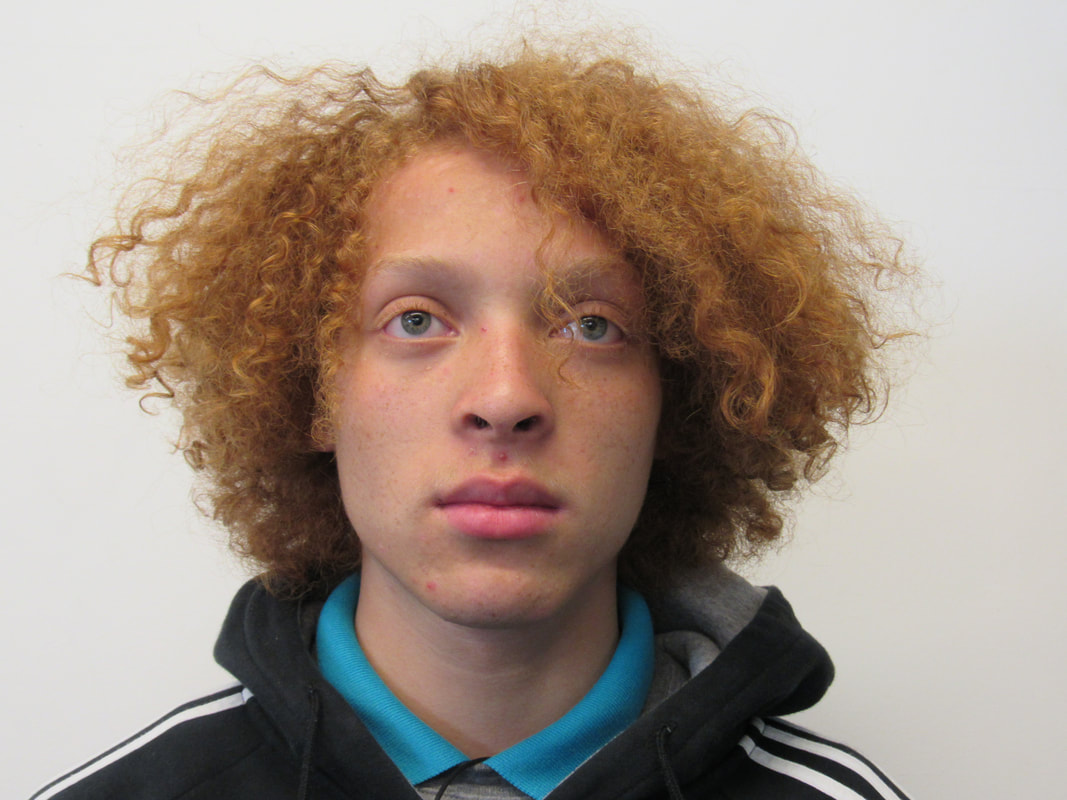

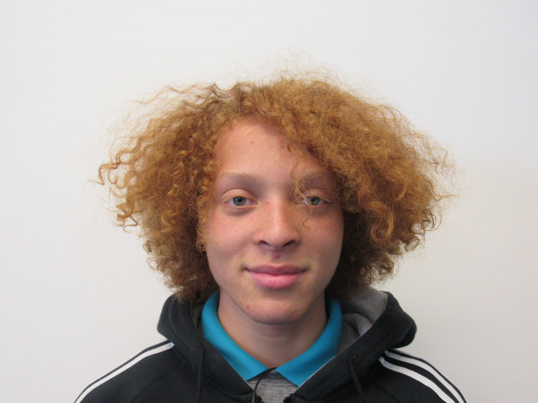
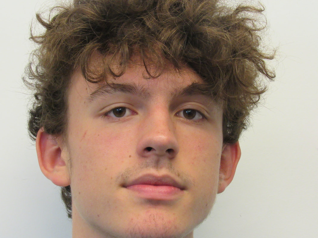
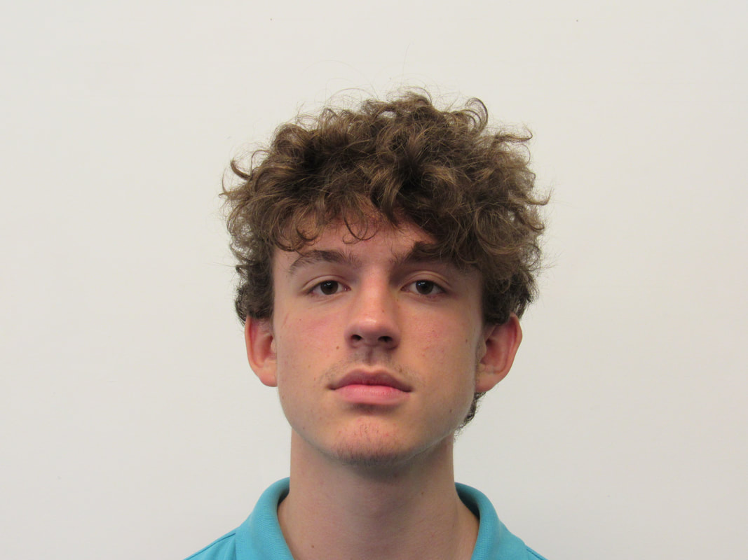
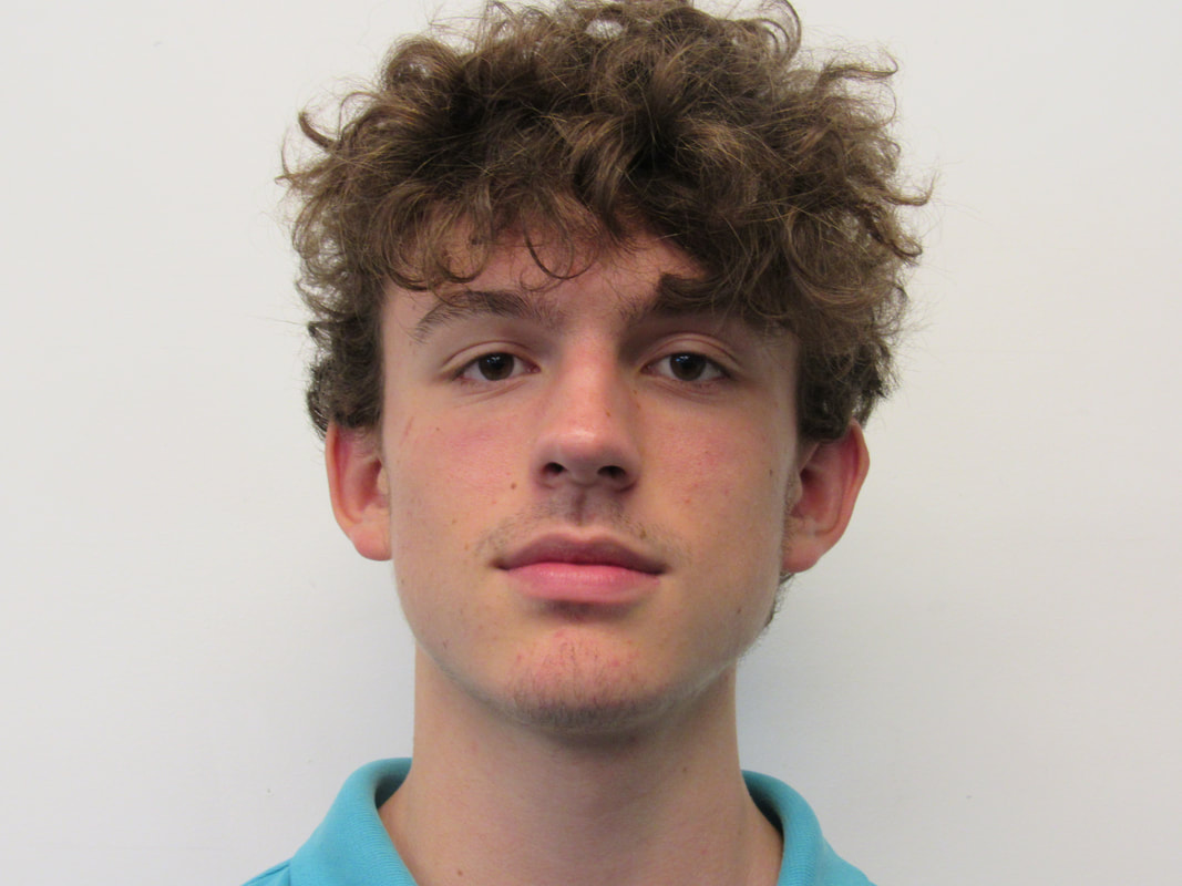
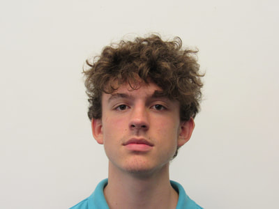
I have begun this part of my experimentation by taking 3 images of 2 peoples profiles (6 in total). In this piece, I will be trying 3 different ways of presenting fragments, all inspired by Lucas Simões; Photoshop, Cutting, overlapping and using fire to create shapes on the photograph. I'm hoping that this piece will be presented as a simple sculpture or a selection. of images.
|
|
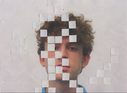
My first approach to my 3 part compositon was using a more digitial technique of photoshop. From past experimentations, I found that using phtoshop wasn't one of my strengths but despite this, I am overall pleased with the outcome. I created this effect on the models face by overlapping two images together then used a range of tools to finalise and create a more smooth, finished look to the photoshop.
Despite being almost satisfied with the outcome, to improve I would probably use a different technique in photoshop such as cutting holes in the models face rather than taking and placing on from another image.
Despite being almost satisfied with the outcome, to improve I would probably use a different technique in photoshop such as cutting holes in the models face rather than taking and placing on from another image.

|
|
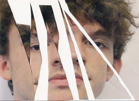
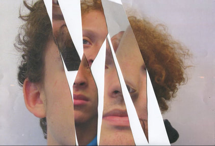
I came across this part of my experimentation almost by accident , especially the way it came out on the scanner. I didn't originally plan to cut the image this way but despite the jagged effect, I find this presents each section of fragmentation in the image in an unclear and subtle way which may come across as quite intreging.
To improve this, I have chosen to combine this photo with another and possibly find a way to merge them together. I'm hoping this will come across as a similar technique to one that Lucas Simões used himself, But, instead of it being a 3D effect it will be 2D.
To improve this, I have chosen to combine this photo with another and possibly find a way to merge them together. I'm hoping this will come across as a similar technique to one that Lucas Simões used himself, But, instead of it being a 3D effect it will be 2D.
|
|
Using the same image I had cut and arranged previously, I then combined it with the same image I used on the photoshop experimentation I did before. When doing this, I did it in two ways; one being a photograph using a Digital camera of how I arranged the cutouts and the other one being arranged and scanned on the scanner. Although this step was almost irrelevant, I first arranged the cut outs on the table so wanted to photograph straight away. Later, I found the quality of the outcome had an orange shade and wasn't as clear as I wanted it to be, so I then decided for a better quality image, doing it on the scanner would be better. This step was important to me as I want all the different outcomes for this experimentation to be pleasing to the eye when all together
I am overall pleased but if I were to improve this outcome I would use two images that where either of the same person, or taken at a similar distance of the peoples faces. Also, I would choose to compose the cutouts differently so they would connect more.
I am overall pleased but if I were to improve this outcome I would use two images that where either of the same person, or taken at a similar distance of the peoples faces. Also, I would choose to compose the cutouts differently so they would connect more.
|
|