Edges
Evaluation
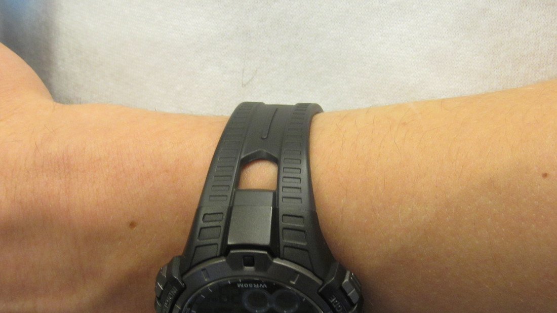
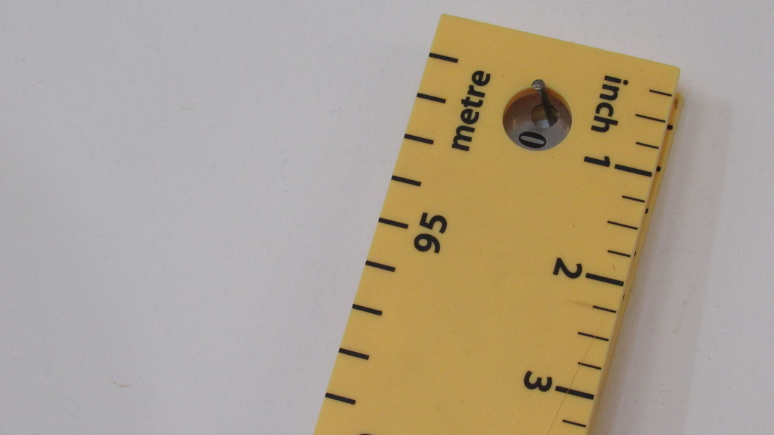
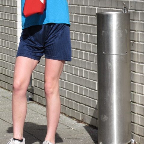
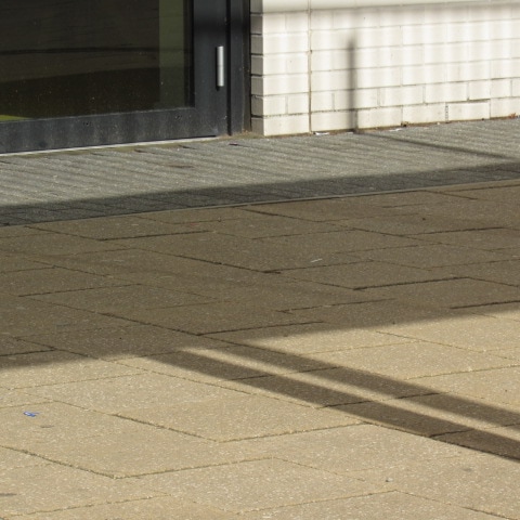
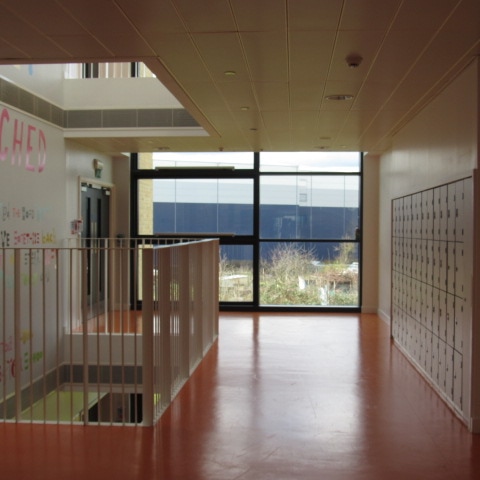
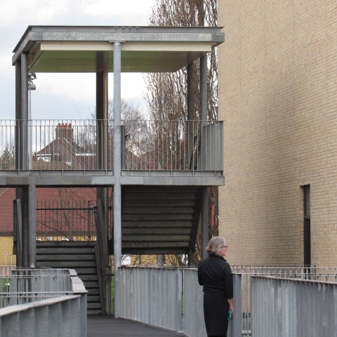
In this task, we had to list 30 edges of objects that we would later photograph. I started the project by taking images of simple straight edges such as tables and chair legs. However, as I got further in the task it became more difficult to think of things to photograph so I tried developing my ideas by experimenting with eyes of facial structures and natural things such as dying leaves.
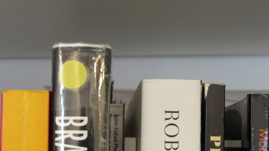
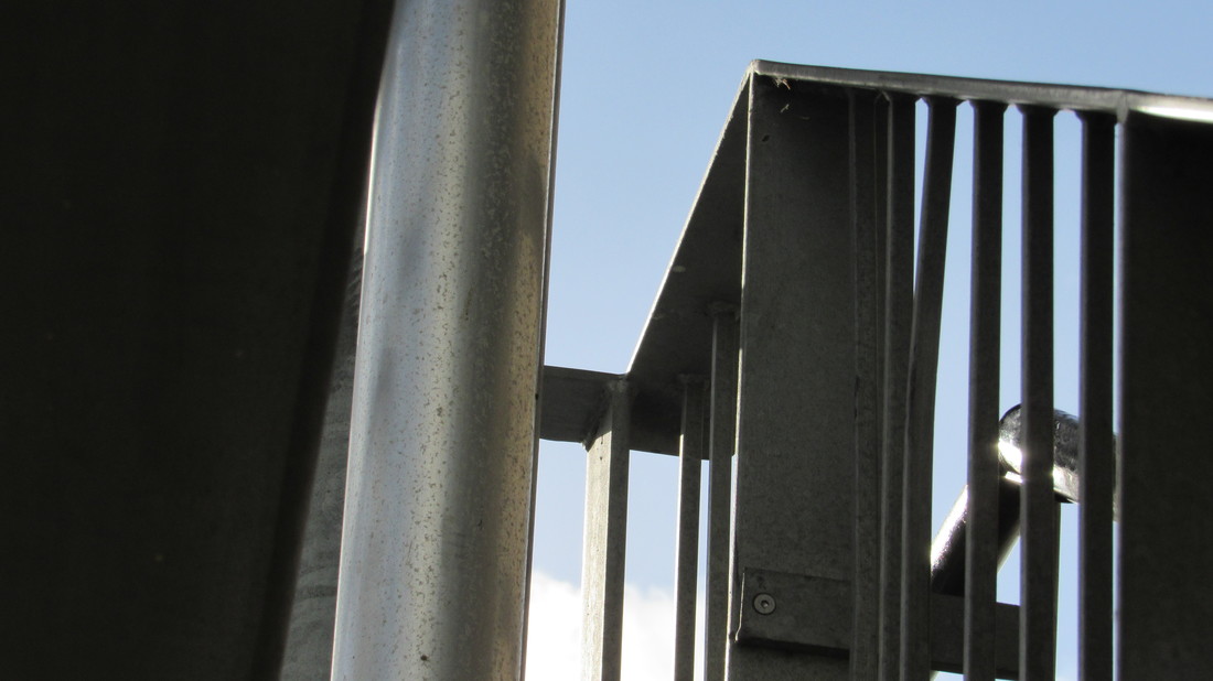
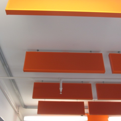
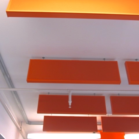
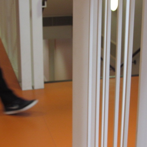
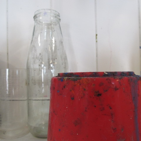
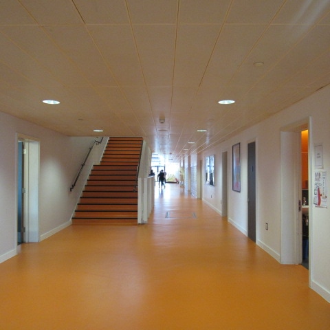
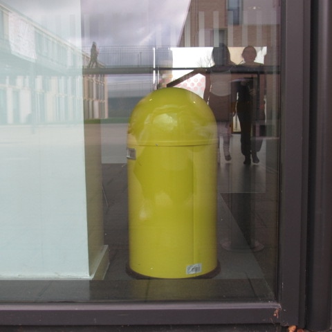
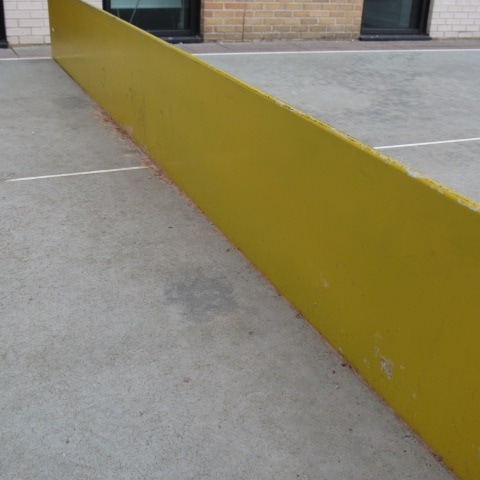
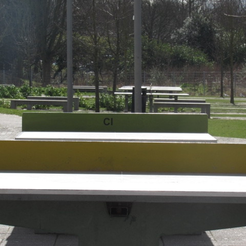
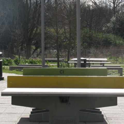
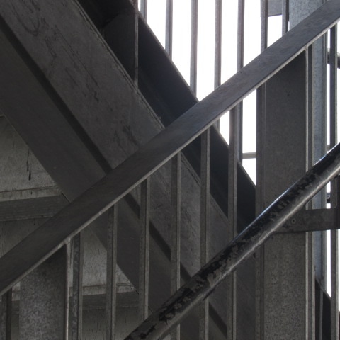
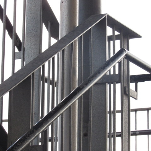
The images below are my personal favourites. I feel they had more of an interesting edge and contained a larger amount of colours and detail. I believe this presents the photographs as more abstract and simplistic. I found that the instinctive idea of images of edges comes across and white dull and easy, but developing photography of edges makes elements such as the unusual shapes and bumps become more obvious. I felt this was quite prominent in the photographs of the books I took. These simple image based on "edges' contain lines, reflections, shadows and colour showing the overseen parts to this project.
The images below are my personal favourites. I feel they had more of an interesting edge and contained a larger amount of colours and detail. I believe this presents the photographs as more abstract and simplistic. I found that the instinctive idea of images of edges comes across and white dull and easy, but developing photography of edges makes elements such as the unusual shapes and bumps become more obvious. I felt this was quite prominent in the photographs of the books I took. These simple image based on "edges' contain lines, reflections, shadows and colour showing the overseen parts to this project.
Pinterest - Edges
|
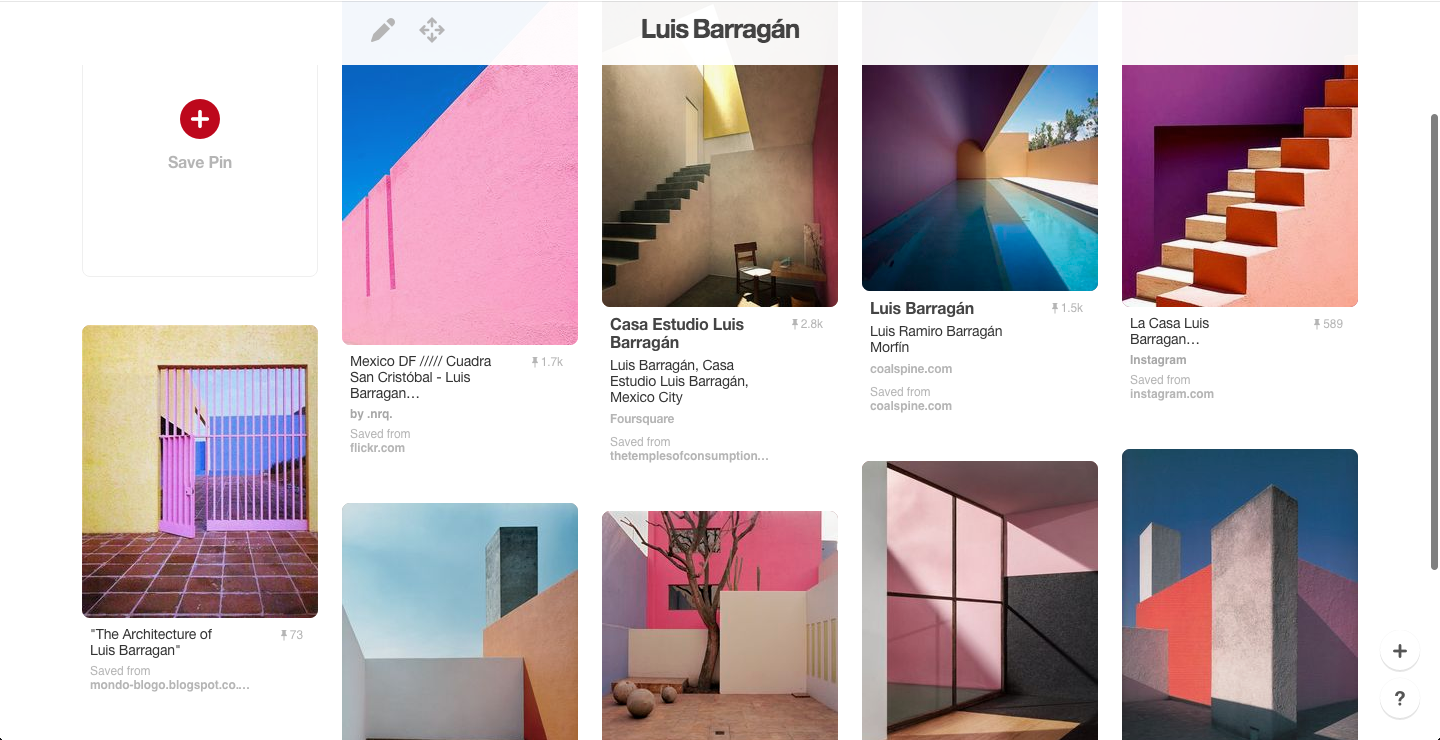
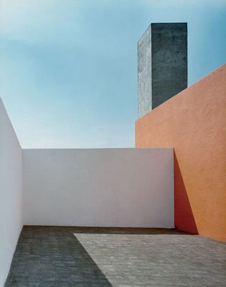
Luis Barrágan
When researching abstract artsits who have taken images linked to the theme 'edges', I came across the photographer Luis Barragán. His pictures mainly caught my attention due to the bright colours and sharp edges. The image to the left was the first photograph i came across and straight away made me want to look more into his work. Barragán seems to take his images in what looks like a bland/mutual setting with intense colouring and fine lines and I think the image, aswell as alot of his other photographs, represents the abstract topic of edges quite well. Luis Barragán tends to finalise his pieces with a edit/filter which really defines the tones of photographs. The main criteria for Luis Barrágan's images; -Composition -Definition -Lighting -Colour -Shadows -Tone -Filter |
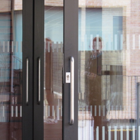
Experimentation 1


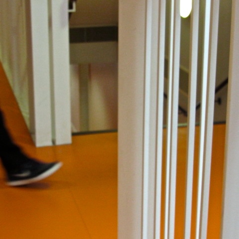
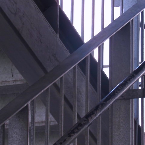
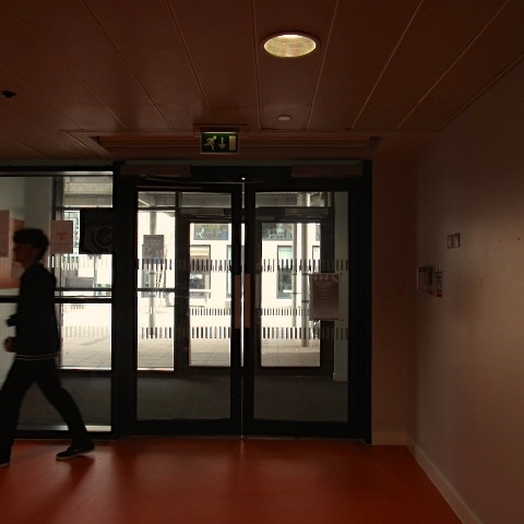
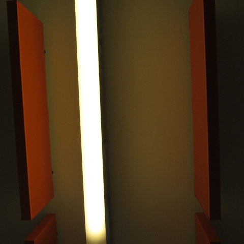
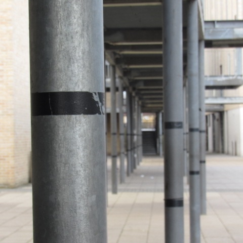
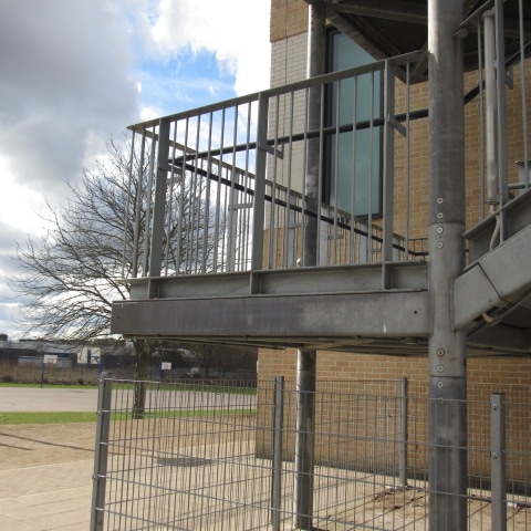
For my first experimentation I chose to focus on the previous artist I researched, Luis Barragán. I focused on taking images of bright colours and linear structures of buildings, doors and poles. The top four are photographs I was most pleased with and felt they relates to Barragán's work. however, after taking these images, I wanted to increase the brightness and make them more saturated. Therefore, I chose to develop these images on photoshop by turning up the brightness, exposer and saturation on each image. Above Ive presented the before and after results. Overall, I think the editing of the photographs added more colour and clear definition, but I still prefer the original pictures. Despite the illumines glow of from the photoshop, I prefer the darker, rustic tone from the previous image.
Down below are more photographs I took based on Luis Barragán.
Down below are more photographs I took based on Luis Barragán.

Experimentation 2
|
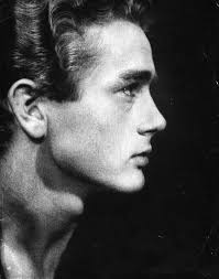
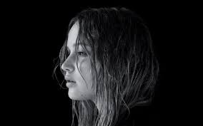
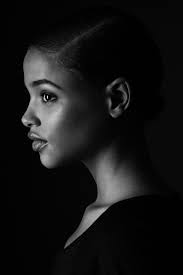
After continuing with my research of 'Edges', I then began to expand on the idea. I started looking online and at Pinterest boards of facial structures and the edges they consist of. To the left are some images I found that caught my attention. the way in which the photographer has captured the modals features emphasises the structures and definitions in peoples faces. I wanted to include this in my final outcome for the topic as this was an idea that seemed out of the ordinary. I feel that facial structures to present 'edges' will represent the topic in a new way. it may also expand the viewers ideas and opinions on the what may seem to be 'basic' and 'boring' topic. |
|
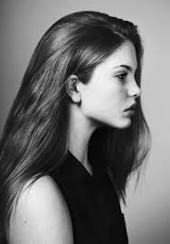
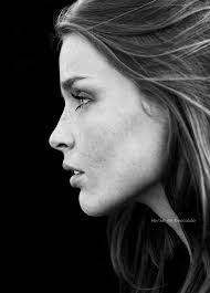
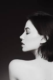
My images
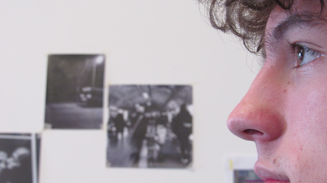
I didn't actually take inspiration for my piece from one artist. Instead, I almost accidentally came across the idea when I was looking at abstract pages on Pinterest. I found various images of side profiles and thats what inspired me to base my 'edges' final piece on the edges of peoples faces. Originally I looked at the artist Luis Barragán because I was intrigued by his bright colours and the sharp edges he would capture but then I found that the images I took that were inspired by him didn't satisfy me as they seemed too simple.
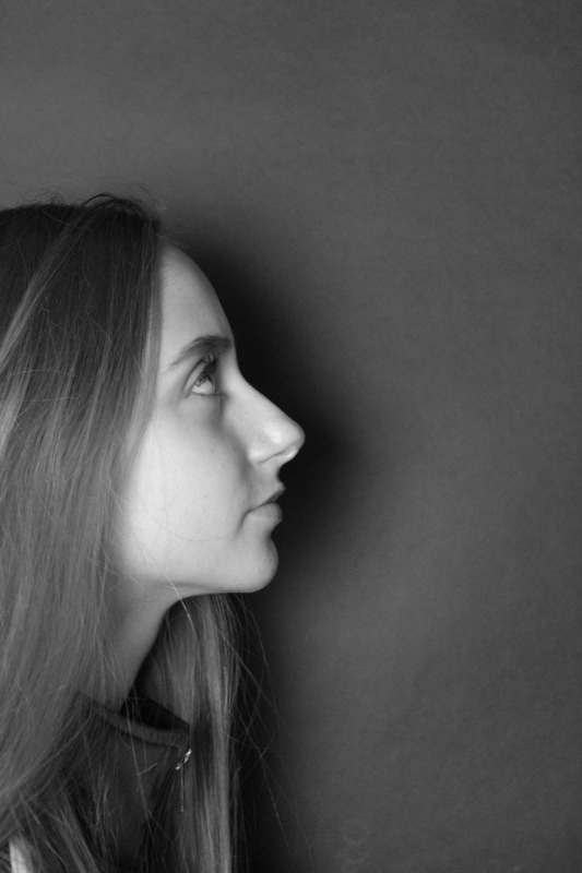
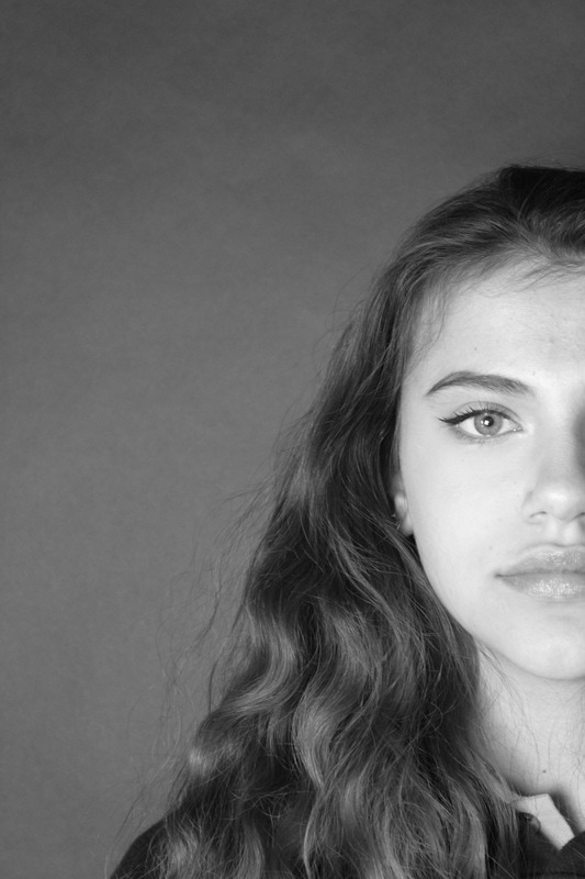
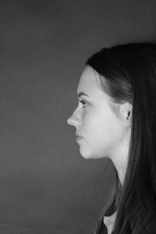
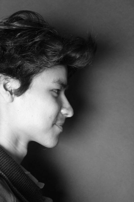
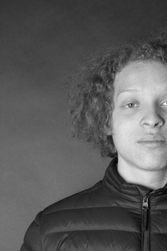
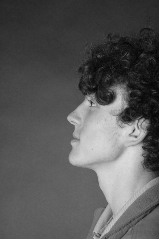
First of all, when taking my images the main elements I looked at where the black background and how intense or gentle I wanted the lighting to be. This was so my photos wouldn't be too washed out, blinding or dim. I did this by experimenting with the different settings on the studio light and looking at how it bounced off the models faces and backdrop. After choosing the correct setting I then focused on the shadows the light was creating, and moved the models and myself until I was satisfied with the amount or lack of shadows the light was creating. After taking the photographs, I then began to think about how I wanted the images to look. For example the type of filter I was going to use and whether I wanted to edit the images in any way. continuing with my minimalistic theme, I chose to use a black and white filter to, like I mentioned, have a bigger impact on the content of the photographs.
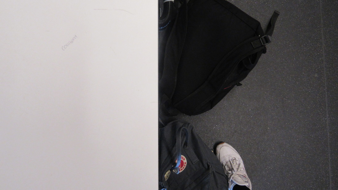
Overall, my final piece has come out how I wanted it to. During the process, I tried using a minimalistic approach to the design of my sculpture and focused on the simplicity of the shades black and white. I did this to have more of an impact on the edges of my images rather than the colour and brightness. I chose to present my images double sided on a folded piece of mount board. I did this so the edges were obviously presented on a large scale, but edges would still be shown in the creation of the physical sculpture. When coming to the actual construction of this, I used a plain white piece of card to stick my images on and then created the dressing screen, 3D zig-zag effect. I did come across some difficulties when putting the sculpture together, such as trying to create a sharp cut edge on the card. Next time, I will do this with more accuracy and care but overall I am fairly satisfied with the outcome.
In conclusion, I feel my final piece has presented what I wanted it to. I think it shows a good representation of the different edges on peoples faces. As well as this, it has a simple yet effective way of presenting itself with the lack of colour and basic structure. However, if I was to improve my project or have any changes, I would make my sculpture a lot bigger. I think that by increasing the scale of the piece, it would have more of an impact on the viewer, since the faces would be bigger.
In conclusion, I feel my final piece has presented what I wanted it to. I think it shows a good representation of the different edges on peoples faces. As well as this, it has a simple yet effective way of presenting itself with the lack of colour and basic structure. However, if I was to improve my project or have any changes, I would make my sculpture a lot bigger. I think that by increasing the scale of the piece, it would have more of an impact on the viewer, since the faces would be bigger.
